As The Doctor themselves once said, "Times change, and so must I." The Doctor has had many faces over the years and will likely have many more in the years to come. However, the Time Lord is not the only one who is in a constant state of flux.
RELATED: Most Evil Villains From Sci-Fi Games, Ranked
The beloved time machine has seen many facelifts over the years, both inside & out. In the classic series, it would change seemingly on a whim; but in the modern era, TARDIS console rooms have a much tighter association with one version of The Doctor. All told, there have been 13 different versions of the time machine in the main series, and that's not including minor changes made here and there to existing ones.
Classic Season 14 – Brown Room Of Boring
Console rooms were predominantly one color for the majority of the classic show. When that color was white, it looked fine; it felt neutral and somewhat peaceful. It would've been nice to have a bit of variety, but it wasn't bad. This console room doesn't have that luxury.
With this room, the designers were going for a high-class feel, like a sitting room in a mansion. It was technically designed as an alternate console room, but it saw a fair bit of usage. The decision to make everything the same shade of brown makes the whole thing look boring at best and ugly at worst.
Classic Season 7 – A Glorified Garage
Thematically, this console room made some sense, but the design doesn't quite work. During this season, The Doctor was supposed to be Earth-bound by the Time Lords. Unbeknownst to them, The Doctor had fixed the TARDIS, and this was a way to keep it camouflaged.
This room is split into two halves. On one side, it looks like a normal (if slightly cramped) sitting room, with nice wall decorations and good color. However, the other half looks like the corner of a garage. The brickwork is on full display (and it doesn't line up), and some ugly metal shelves sit in the corner.
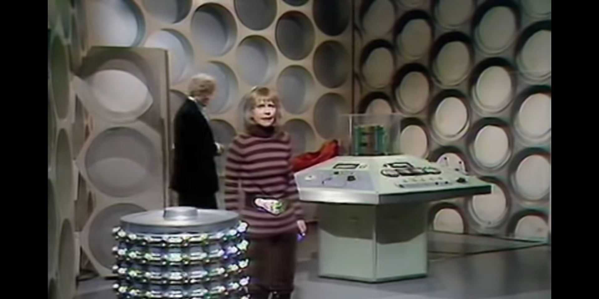
Classic Season 9 – Salad Bowls
The Third Doctor eventually got a more standard-looking console room, but even that had its problems. Many of the console rooms from this era look similar, and this one tried to stand out in a terrible way.
The patented Round Things that the modern Doctors are so fond of (despite not having any) have gone from being a part of the wall to being fixtures stuck onto it. The result is what looks like a bunch of salad bowls stuck to the walls. It looks ridiculous and pretty darn cheap.
50th Anniversary – Two Worlds That Don't Mix
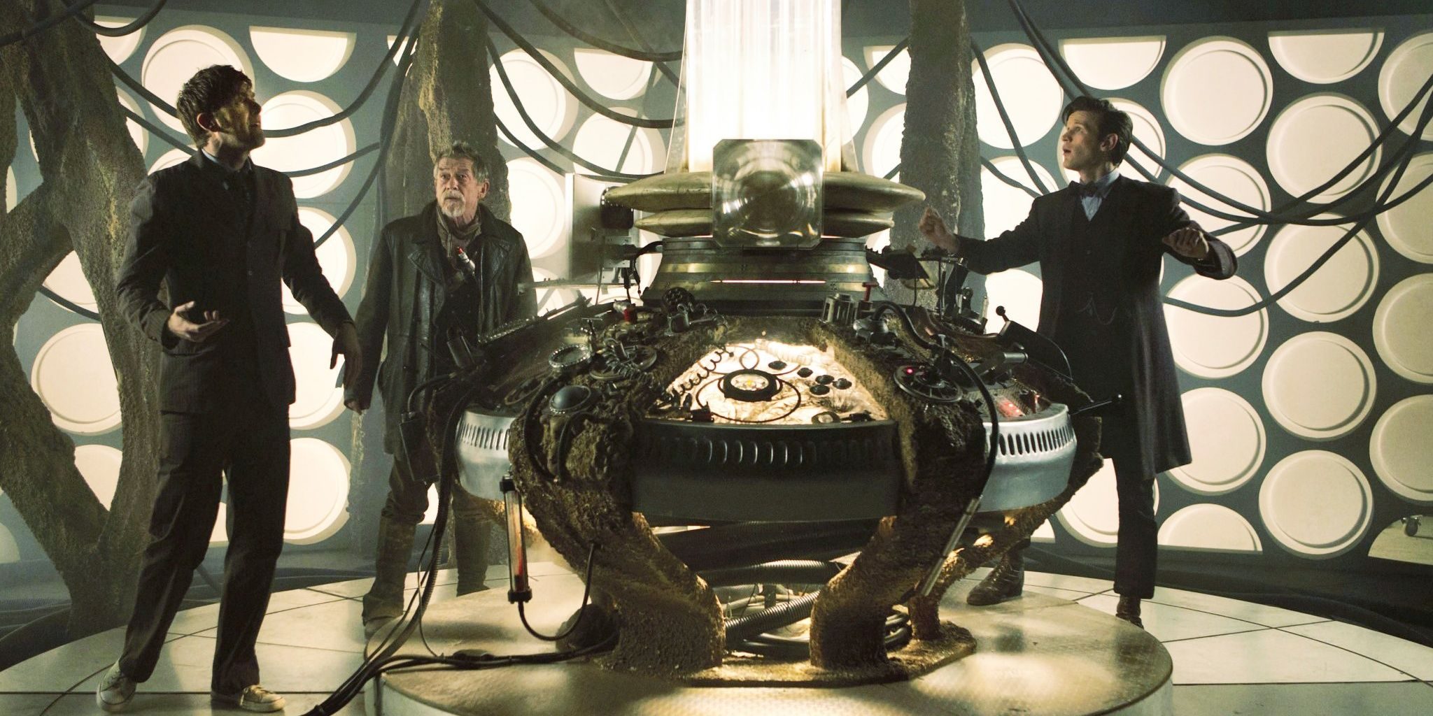
The show's 50th Anniversary special episode gave the world a brand new version of The Doctor in the form of John Hurt's War Doctor. Towards the climax of the episode, fans got to see this Doctor's TARDIS too.
The white backing with the Round Things are there, but so are the skewed pillars the next chronological incarnation would have. It's a good concept, but visually, it doesn't fit. The designs are good separately, but they're so different that when put together, they feel at odds. It could be argued that this makes sense for the War Doctor's character, but it doesn't change the fact that it's ugly.
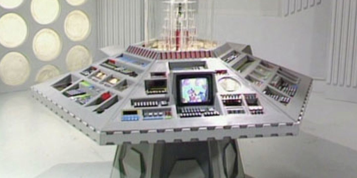
Classic Season 20 – Columns
This console room doesn't do anything especially wrong. It's just a bit dull compared to the rest. The white coloring can only get a design so far, so this one was broken up a bit by the columns around the walls. These look fine, but take away a bit of light from the room.
RELATED: Best Sci-Fi MMOs With Awesome Settings
The space on the set feels a bit more cramped too. The Doctor and his companions don't have as much room to move around and act in the space. The Round Things feel like they have less life to them as well. Not only are they smaller and much more organised, but the light they produce is faded.
Classic Season 8 – An Altered Classic
This was the first console room since the very first one to use the classic design, and it does a decent job. The general feel of the original room is still strong, and the modern colors and lighting make it look as good as can be expected.
Its only problem is that it feels lesser than what it's trying to alter. This may be a production issue, but the lighting in the set is completely off. Shadows are very clearly cast in multiple directions, with no sense of where the light in the machine is supposed to be coming from.
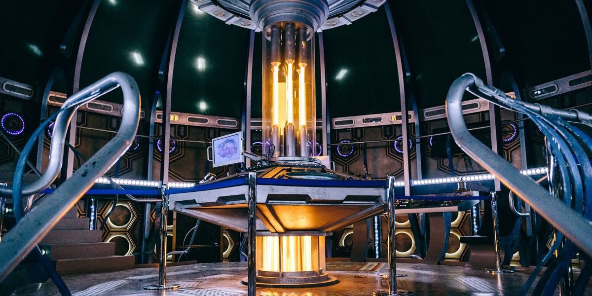
Modern Series 11 – A Bit Too Different
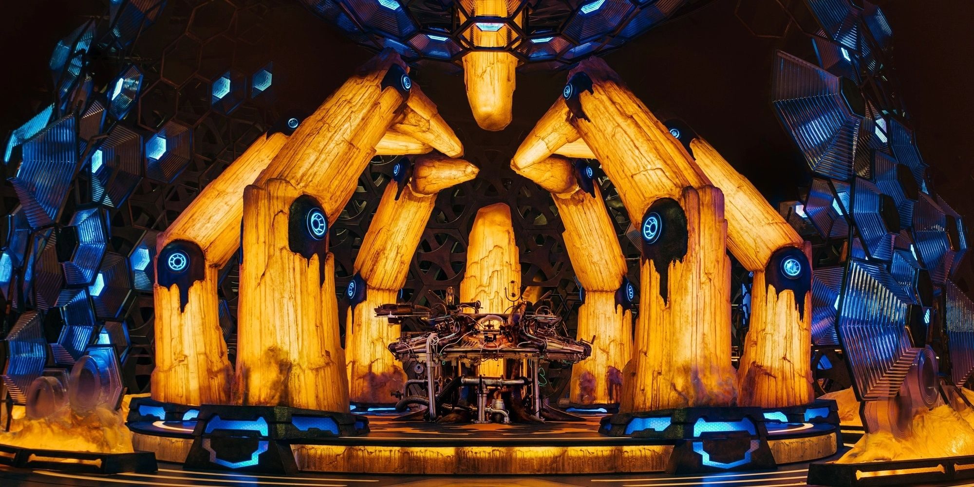
There is a lot to like about the current iteration of the console room. The blue and orange colors are visually pleasing, and the jagged crystals make the room feel a bit erratic but also quite beautiful.
The problem is that it's so different from everything that came before, it crosses the line into feeling like something different altogether. It doesn't help that the Thirteenth Doctor spends very little time in the machine compared to her predecessors, as it takes slightly too far of a step away from its roots.
Modern Series 7/8 – Cold But Cool
Many count these as separate console rooms, but aside from some bookshelves and lightbulbs, they're identical. Initially, this console room felt drab and lifeless. It was all smooth metal, which had a cool look but wasn't inviting.
Thankfully, when the Twelfth Doctor took the reigns half a season later, things improved. The metallic feel was still there, but the additions of bookshelves and the change from blue to orange lighting made the whole thing feel a bit warmer. It still wasn't perfect, but it didn't feel like a scary place to be.
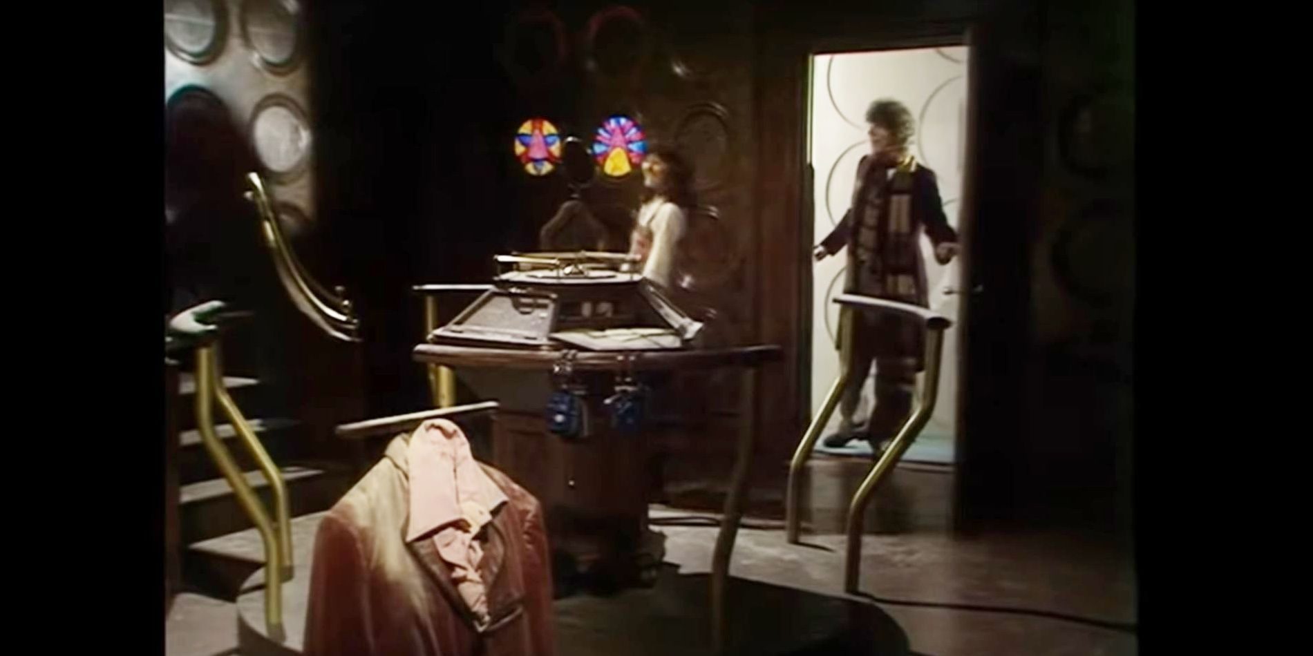
Classic Season 1 – Open & Iconic
While the very first console room isn't perfect, it's no accident that its design patterns stuck around. What's so striking about this set is how huge it is. The floor has so much open space, which allows everyone breathing room.
The lighting is a bit wrong, but the fact the show was in black & white helped this issue go unnoticed. If nothing else, it established what a TARDIS should look like, and those ideas have persisted in every console room to date.
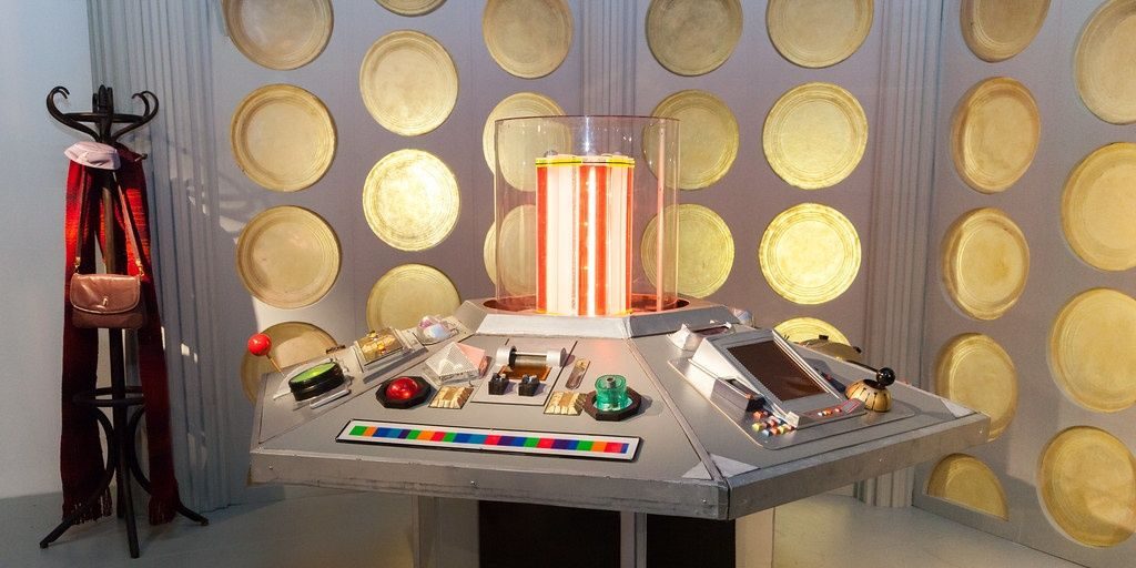
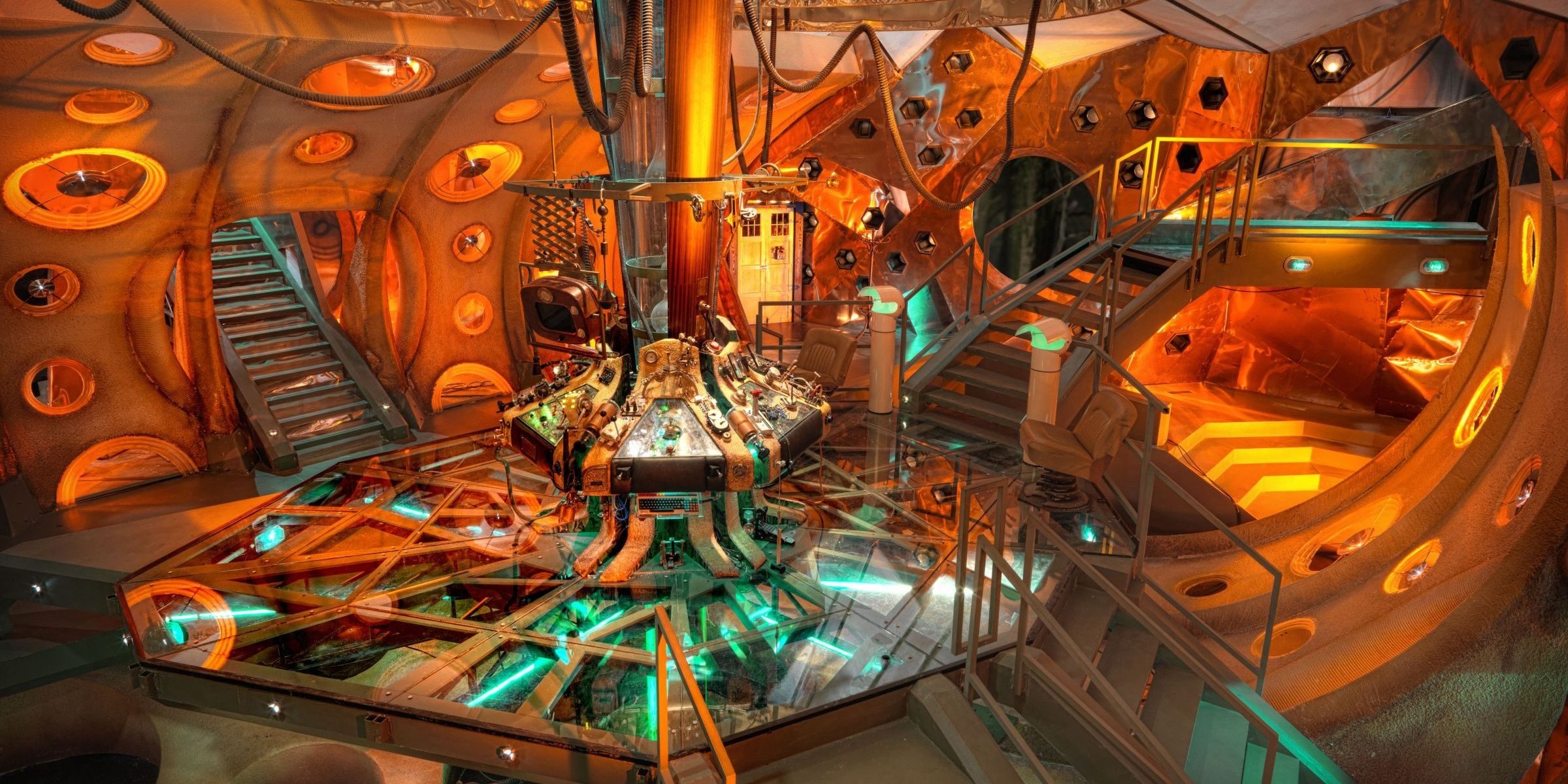
1996 TV Movie – A Living Room
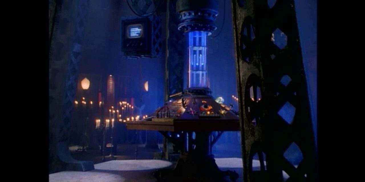
Despite still being almost a decade out, this console room has much more in common with the modern consoles than the classic ones. The console room is just a small part of a massive living space for The Doctor. It seems this room is where The Doctor spends most of their time, so it should be comfortable.
This was the first console room to give interesting colors to the TARDIS. The deep blue of the main column draws the eye, and the darker colors around the rest of the room make it feel homely. It's mostly browns, but there's enough variation to give a fancy look.
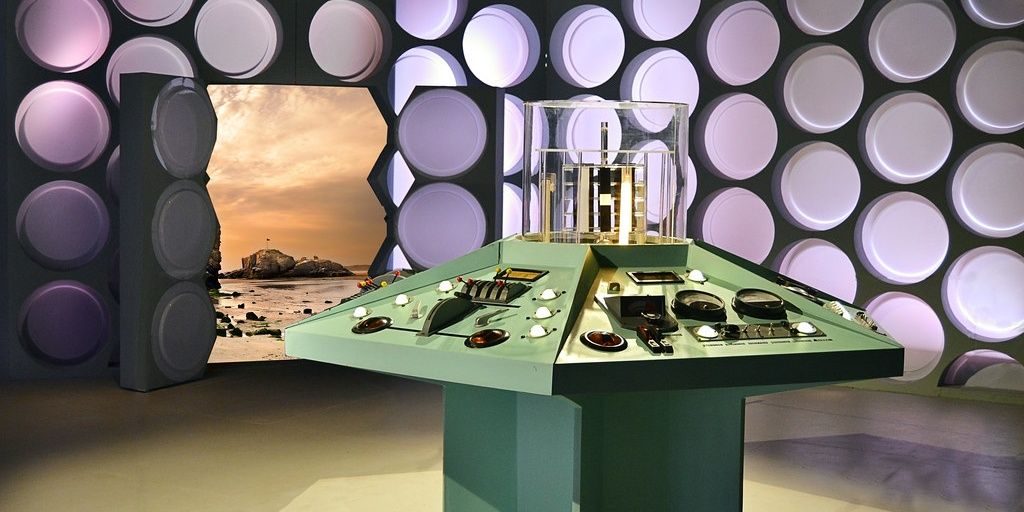
Classic Season 21 – Perfected Classic
The last of the classic console rooms is far and away the best; it's no surprise it stuck around for so long. The console itself is the star of the show. It'd had a lot of changes by this point, but this is where it reached its visual peak. It had colorful buttons all over, but they were organised in a visually pleasing way. It naturally draws the eye as few consoles had until now.
RELATED: The Best Sci-Fi MMORPGs, Ranked
The walls struck a perfect balance between the classic style with modern compromise. The section near the screen had just enough patterns on the walls to look interesting, while the Round Things were big and bright. There was plenty of space, and it had a bright atmosphere.
Modern Series 1 – Grand & Chaotic
When Doctor Who returned to TV in 2005, it had to make a clear statement about what this modern incarnation of the show would be. This TARDIS console room is a brilliant balance that made it clear that the modern series would stay true to the classics, but would still experiment, change, and be its own thing.
The weirdly shaped columns are brilliant; they feel weird, but don't look out of place. The color of the walls had the potential to look bland or ugly, but the lighting of the set, along with the faint greenish glow from under the floor, made it work. This is the definitive version of the TARDIS for a generation, and it's quite popular amongst the fanbase at large.
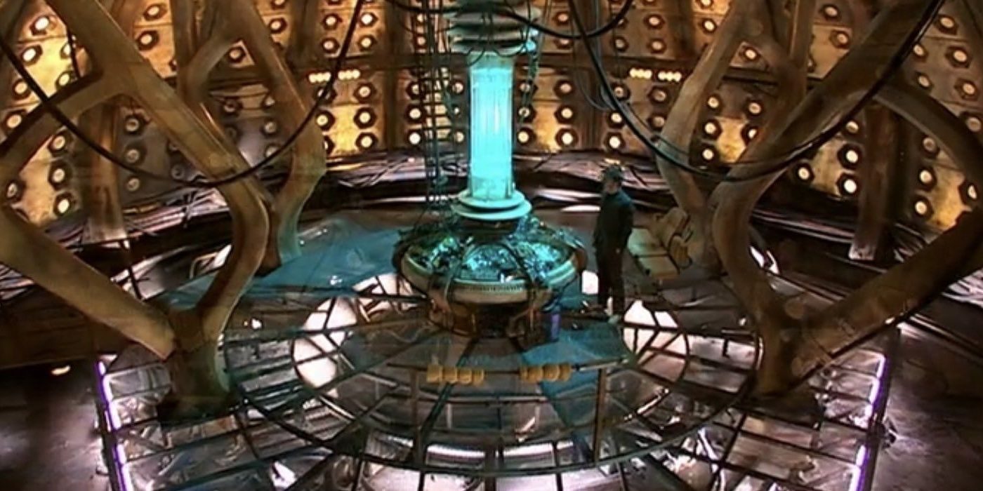
Modern Series 5 – A Madman's Box
The first redesign since the start of the modern series, this console room was another statement about how the show would be different in Matt Smith's first episode. The central console and platform are familiar, but less rough around the edges. The floor is glass instead of a grate, and the console is neater with a few strange additions.
There was also a lot to look at off of that main platform. With large entranceway and several stairways and corridors branching out in different directions, it looked chaotic but fun. Any kid who looked at those things reaching off into the unknown would want to run around there and see how everything linked up, like a big video game level. It was the perfect encapsulation of the Eleventh Doctor, which is what makes it brilliant.
NEXT: Greatest Sci-Fi Anime Of All Time