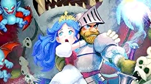
One of Capcom's most celebrated and beloved franchises, Ghosts 'n Goblins Resurrection for Switch is something of a treat, modernising a classic game with Nintendo's console hybrid technology, while at the same time honoring some of its most iconic moments. It's also one of the first Switch games built using Capcom's excellent RE Engine – the other being Monster Hunter Rise. While a very different sort of game, Ghost 'n Goblins showcases just how flexible the tools and technology truly can be and while this release has proven divisive to fandom, I think it's an excellent effort overall.
Personally, I love the way that the high-end RE Engine combines with hand-drawn imagery to deliver a game that looks modern but feels like an evolution of the series' 2D roots. It's a look that really grew on me as I played but it is certainly unusual at first glance. Unlike, say, the two Ori games, which uses multiple layers to build its scenes with soft, alpha edges, Ghosts 'n Goblins looks a little different. Pixel edges are visible within the artwork – so it's slightly more aliased than, say, Ori or Cuphead. However, it does reveal the rendering resolution with relative ease. When docked, this artwork is displayed at a fixed 1080p resolution while portable mode drops to 720p instead.
These visible edges certainly result in something that feels like a hybrid of 2D and 3D, but it looks great overall. Each stage features significant depth in the parallax scrolling with many overlapping layers. Scenery is highly dynamic as well – of course, you can expect storms with rain and blowing trees, much like Ghouls 'n Ghosts, but there's much more here including stages that break apart as you progress leading to unexpected shifts in design. It's this flexibility that allows for some of the most ambitious level designs in the series' history while still building off the original designs. There's equal love for Ghost 'n Goblins and Ghouls 'n Ghosts here to the point where you have your choice of intro levels which pay homage to each of the series titans in turn – they're much longer than the originals but retain many of the same beats. It sets the stage for the modernising work that persists through the entire game and I feel it's a fantastic way to approach the design – it's mostly new in terms of layout but it recalls so much of those classics and looks beautiful doing it.
