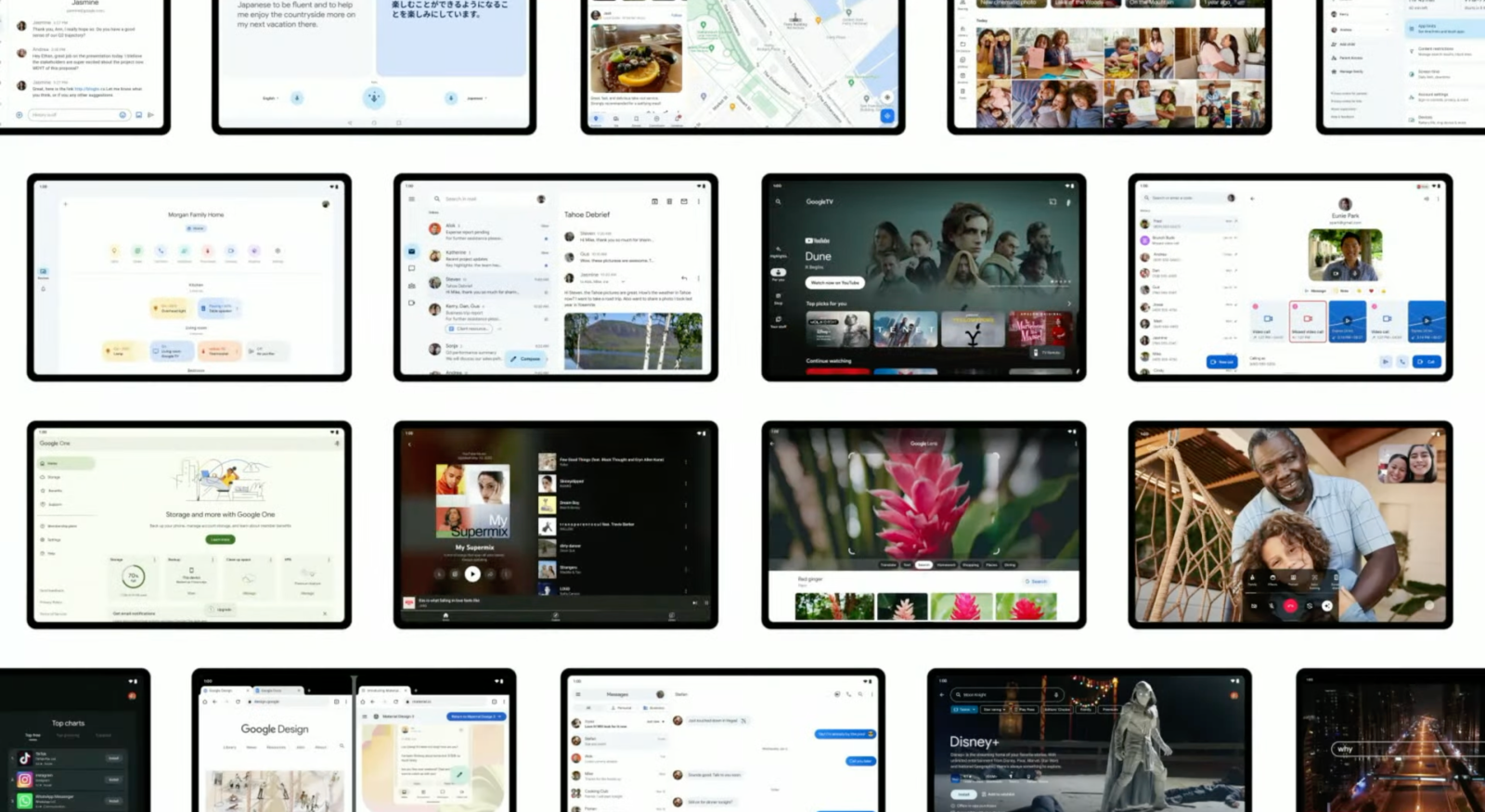
At I/O 2022, Google announced that it will update over 20 of its first-party apps for large screens in a show of its commitment to the form factor. This will undoubtedly improve the experience for existing owners and is meant to encourage other developers to do the same. Here’s every Google app on Android that has a tablet update and what’s still to come.
Google apps with tablet UIs
- Reverse chronological order, latest updates at the top
—Google Play Store
Update 9/30: Ahead of a broader redesign, Google has updated the Play Store with a navigation rail that is more compact than the previous drawer.
At the moment, this allows app icons to be larger but those carousels will soon make way for cards. Google Play has also tweaked the corner logo and search field to be more compact.


—Google Drive, Docs, Sheets, Slides
Update 9/17: You can now open multiple instances of Google Docs, Sheets, and Slides (version 1.22.342.08.90+) to view them side-by-side. However, getting them to that state is a bit of a manual process.
You open the first document and then go back to the Docs/Sheets/Slides app (using the system Recents multitasking menu) to launch the second. Reopen Recents and drag the first file to initiate split-screen. It’s not as easy as Drive’s “Open in new window” button, which has been renamed to “Open in split view” (and only works on folders).

Update 8/3: Google announced last week that Drive and Docs/Sheets/Slides are getting tablet optimizations. Some of the features have rolled out, including the ability to:
- Drag images/text from another app (like Chrome) and drop into a document or spreadsheet cell. Similar to Google Keep.
- In Google Drive, you can upload files by dragging and dropping them in.
- You can open two Drive instances side-by-side by opening a folder’s overflow menu and selecting “Open in new window.”
- [Not live in our testing] “You can also add links to Drive files by dragging the file into an open app like Keep.”
- Physical keyboard shortcuts in Drive, Docs, and Slides to select, cut, copy, paste, undo and redo.


—Google Drive and Keep widgets
Update 9/13: Google is optimizing widgets for Android tablets by making them larger given the additional screen real estate available. Drive (with version 2.22.357.1) adds a row of shortcuts to the Drive quick actions widget that creates a new document in Docs, Sheets, or Slides. This homescreen object is also notable for introducing a new circular configuration.
Meanwhile, the Google Keep (5.22.342.03.90) Note List widget gets rid of the right sidebar for a faux bottom bar in narrow configurations. This matches the Gmail widget and lets you see more notes. However, you can still get the old design by increasing the width.


—Google TV
Update 8/28: Google TV was one of the apps slated for a redesign at I/O. A tablet-optimized version is now available, but without the Material You stylings shown on-stage. The primary change is a navigation rail with centered tabs that replace the bottom bar. We’re seeing this new look with version 4.33.60.17, which is not yet widely rolled out, on a Chromebook.
Back in May, Google’s slides depicted a much wider rail with oblong indicators noting your current tab. Meanwhile, the Material You iteration looks to redesign the app bar so it’s more seamless. The existing design is an issue in the Your stuff page where top tabs are used.


—YouTube Music
Update 6/6: The tablet optimization announced for YouTube Music at I/O 2022 is now rolled out. It sees the Android app on large screens get a redesigned playlist view, which is a big part of the service. There’s a two-column UI where cover art and other details appear at the left and the song list is on the other side. [Update 6/30: The redesign was introduced to albums later on.]
This is just the latest in tablet update for YouTube Music, with that team starting earlier this year on the Home feed to let you see more content in carousels (Listen again, Your favorites, Mixed for you, etc.) without having to scroll. Other optimizations exist in Now Playing (two-column view with controls at the left and your Up next queue at the right) and side-by-side settings.


—Clock
Update 6/3: Google Clock 7.2 starts by introducing a left-sided navigation rail on tablets that gives the app more vertical space as a result. The other big change is the use of two-column layouts, when in landscape orientation, throughout the application.


—Calculator
Update 5/25: Version 8.2 of Google’s Calculator app brings a two-column layout where you can always see your calculation “History” on tablets and other large screen devices. Other parts of the UI are shrunken down accordingly and this is particularly suited for multitasking.

—Google Lens
Update 5/18: Version 13.19 of the Google app lets Google Lens open in landscape mode. The visual search tool was previously restricted to portrait orientation on Android.


—Google Photos
Google’s premier tablet app on Android is Google Photos, and this update rolled out in January of 2021. It’s not too different from the web UI. A navigation rail on the left edge means you can see slightly more vertical content, while more tabs can be shown – compared to a bottom bar – without looking cramped. In addition to Photos, Search, Sharing, and Library, you have quick access to On Device, Utilities, Archive, and Trash. One small Material You tweak that Google made in recent months is a pill-shaped indicator to note what tab you’re viewing instead of just highlighting the icon.


At the top of the screen, next to “Google Photos,” is a search bar with rounded corners. When viewing a photo fullscreen, swiping up reveals a right-hand pane while the overflow in the top-right corner of the viewer shows actions with accompanying icons.
—Google Calendar
I’ve already opined how Google Calendar is my favorite tablet app, primarily because of the great Day and Schedule views where you see the entire month on the left with a list of events next to it while illustrations liven up the background. It does not appear that the company is planning any changes.


While there’s obvious reuse from the website, the Calendar team has meaningfully differentiated the app for tablets, and that’s surprisingly a rare occurrence for Google.
—Chrome
Chrome on Android tablets is nearly identical to the desktop interface given the use of tab strips and Omnibox layout. There’s also support for multiple windows to aid multitasking.


—YouTube
YouTube is fairly well-optimized for tablets with two-column views throughout, and Google’s I/O preview only showed the player screen. It could always switch to a navigation rail.


—Google Translate
Translate already has the tablet optimizations touted on stage. In general, it’s better for this app to be sparse and have a lot of spacing, given its nature as a (physically) shared interface/tool.


—Files by Google
- Navigation rail

—Google Podcasts
- Two-column view

Google apps getting more tablet tweaks
—Google Maps (see below)
Maps for Android already has a two-column view, but an upcoming update replaces the full-width bottom bar with one that fits in the left panel.

Future Google tablet app updates

- Google Translate: See above
- Maps: See above
- Photos: See above
- Family Link: Instead of a navigation rail, Family Link looks to be using an always-showing navigation drawer.

- Google Home: Centered navigation rail, though it looks ridiculous with just two tabs. A two-column layout could be better.
- Gmail: Navigation rail with a drawer button at the top to see your folders and labels.
- Google TV: Navigation rail while you can make out the upcoming Highlights news feed as part of that broader Material You redesign.

- Messages: Two-column layout, though it’s unclear if the UI shown above is more meant for foldables rather than tablets that require Device pairing, like Messages for web.

- Google One: Navigation drawer with heavy use of cards in the app body.
- YouTube Music: See above
- Google Lens: Visual search today on tablets only works in portrait orientation.
- Google Duo: Centralized controls.

- Google Play: Like Photos, there’s a navigation rail and top search field. Cards are used to show various lists and promotions.

- Chrome: See above
- [Repeat] Messages
- [Unclear] Play Store search or Entertainment Space.
- YouTube: See above

- Google Calculator: Two-column layout.
- Google Clock: Navigation rail paired with two-column layout.