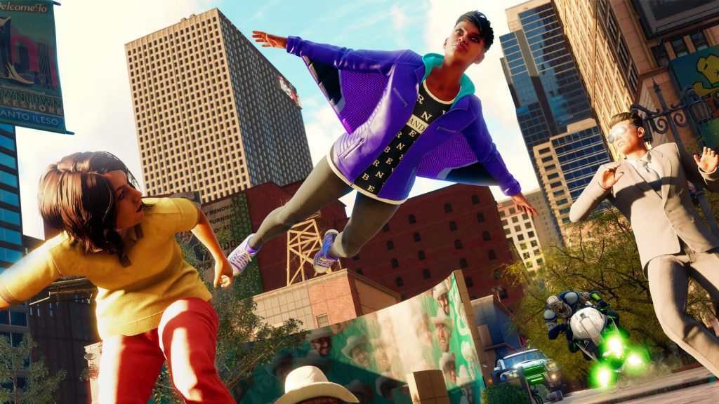
Last week, I got to have a closer look at the Saints Row reboot from Volition. As you would expect, it looked bombastic and eclectic, with a myriad of unusual ideas that can only really be married together in a Saints Row game.
However, at this point, it also felt like Volition has focused a bit too much on adding in all this “stuff” to the game, and seemingly at the cost of some polish and finesse. Saints Row was confirmed to be a cross-gen release on its initial announcement last year, and that seems to be a fair market for it. Right now, it just looks and feels like more of a last-gen game than a current one.
Throughout the showcase, Saints Row’s fighting appeared to be a touch clunky, while its cutscenes and dialogue felt more forced than we may expect from a game today. Meanwhile, during a close up of the Boss’ face, you could clearly see that the character’s eyelashes and eyelids did not match up in the way you would expect them to. This could be a bug that will be fixed by launch, but it was nonetheless jarring on the eye (mine, not the Boss’, although their eye did look jarred as well).
