Over its nearly three-decade run in the console space, Sony has been able to release five separate PlayStations out into the wild all with their own unique user interfaces – seven if you count their handhelds. All of them, with their own UI’s designed to meet the needs of gamers of the era in which they existed. some certainly did a better job of that than others but all of them certainly have their advantages -and their quirks- that made them stand out for their time. From the minimal to the intricate, and the pertinent to the completely obtuse, let’s take a look at all of the PlayStation UI’s and what made them interesting.
Where else to start but the beginning? In 1994 the world got its first good look at the beginning of what would be a very long and lasting legacy of video game consoles from Sony. The PlayStation 1 – or as it was called at the time, the PlayStation – was of course the result of a falling out between Sony and Nintendo, and Sony’s ultimate decision to enter the gaming space on their own, something they of course avoided for quite a long time but eventually decided to go all in on. Thankfully, Sony’s bet ended up paying off and the PlayStation set the gaming world on fire with its next-generation processing speeds and CD-ROM based gaming. Sony sold over 1 million PlayStations within the first 6 months of launching this machine.
With all of that fanfare and with so many gamers who still have memories of playing their PlayStations today, you would think more people would remember the PlayStation 1 actually had a user interface, but alas, many never knew it did. So many gamers were used to putting a game in their system man turning it on and booting straight into the game that it didn’t even occur to them to try turning on the system without a game in it or with something in it other than a game just to see what happens. However, if you were one of the curious few who did, you would be greeted with a somewhat strange purple screen with two simple options; memory card or CD Player. These two options were of course self-explanatory even for the time and would take you to a sub menu where you could interact with either thing, provided that they were plugged into the PlayStation at the time.
Even more surprising than the fact that this actually had a user interface at all was the fairly useful nature of it all with lots of options. The memory card management menu would let you delete save files you didn’t need anymore, or back them up to a second memory card. You can choose to copy one at a time or copy the entire card over to another all at once, which was pretty spiffy for the time. You could also of course exit this menu and go back to the main menu where you could choose between that and the CD player. The CD player would of course give you all of the options that you would see on most CD players of that time.
Play, stop, pause, track skipping, even shuffle and repeat were options here, making the PS1 a pretty decent CD player that you could hook up to your stereo and use just fine. It was in some ways even superior to a typical CD player at the time, as it would visually display to you just how many tracks there and how far into the track you were at any given time which not every CD player did back then. With so many fantastic games and innovations coming out of the PlayStation it can be easy to forget that it had one of the best UIs of its time. Visually it was a little weird, I suppose, with the purple background and the neon splotches highlighting the main options, but if you grew up in the mid-90s then you probably remember that almost everything kind of looked like that back then.
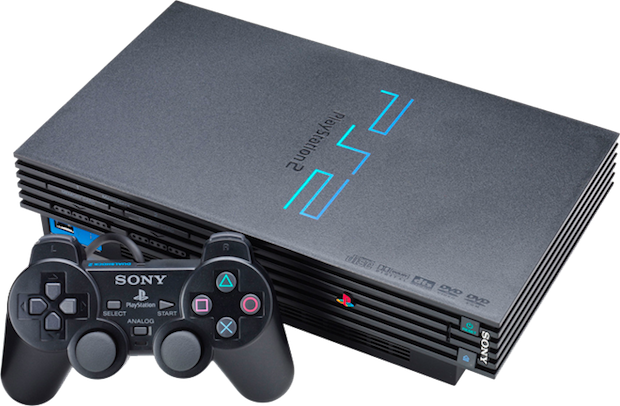
The PlayStation 2 user interface was a completely different story. The new millennium was a very different time than the mid-90s and with that came new expectations for gaming consoles and electronics in general. It wasn’t just about managing your memory card and listening to CDs anymore. now people wanted different display options for different types of TVs. different types of audio output settings for their surround sound systems or whatever they had set up, and people wanted to do more than just listen to CDs on their gaming consoles, hence, of the best ideas Sony has ever had; making the PlayStation 2 compatible with DVDs. At the time DVD technology was fairly new and expensive, so this made the PlayStation 2 one of the most popular DVD players out there. As a user interface though the PlayStation 2 had a complete overhaul from the PlayStation 1’s minimalist approach. Instead of a funky purple background PlayStation 2 was mostly black and kind of foggy. Instead of a long drawn-out Sony Computer Entertainment screen, the PlayStation 2 just showed you some weird three-dimensional block send flying lights and some weird blue fog in the background.

There’s definitely a lot more going on in the aesthetic department, but what mattered more was the functionality and you had a lot more of that here on the PS2 than you did on the PlayStation 1. Here, all of the memory card management options that you had on the last system we’re also on the PlayStation 2 but this time with animated icons that danced around which didn’t really add anything to the equation other than a little personality to their files icons. Outside of that though you could change several things about your system configuration including the video output, the language, the internal clock, screen size, and more, all while being dazzled by three dimensional spinning crystal things in the background that I never really understood. but definitely looked cool. Of course, there were playback controls for DVD movies as well as compact discs that made the PS2 a highly functional machine for people that didn’t even care about games.
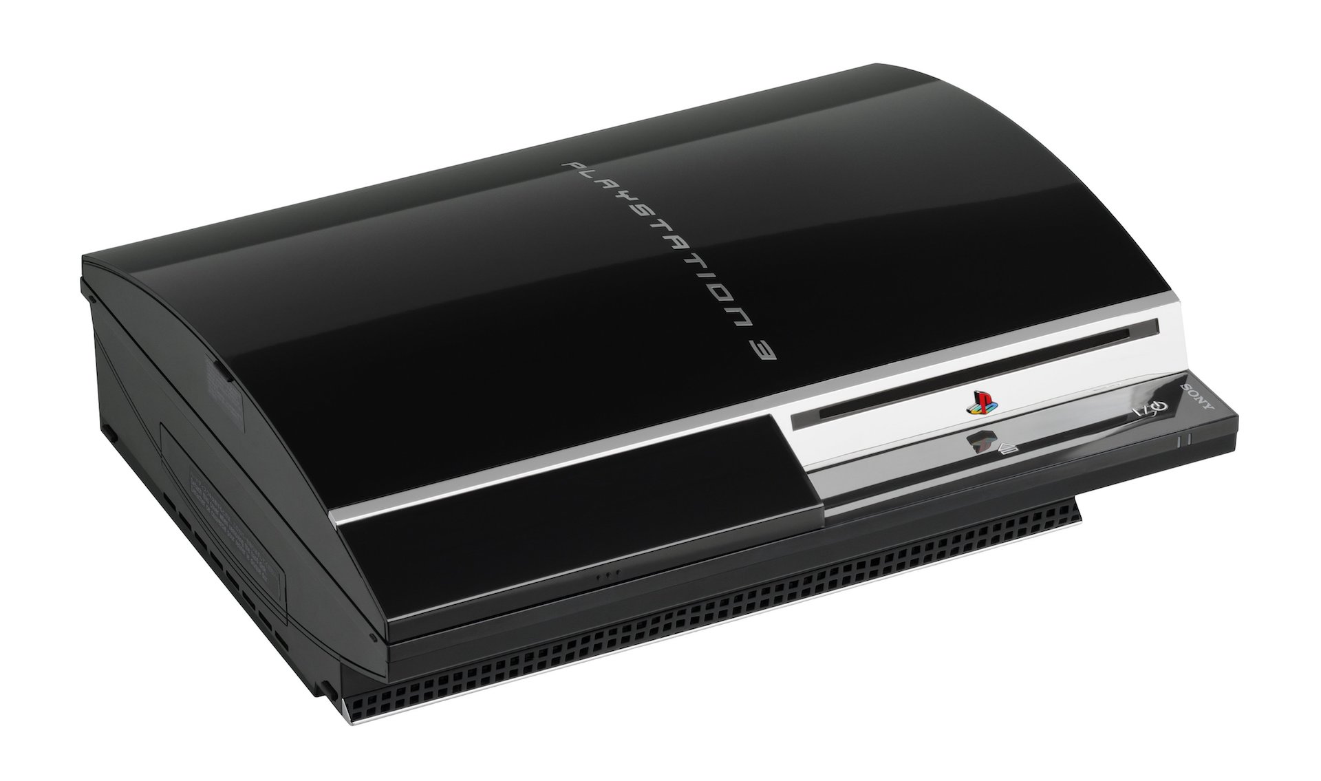
The PS3 is where Sony’s user interface arguably peaked, at least in terms of design. Everything you would expect to have from the PlayStation 2 and a whole lot more was on the PlayStation 3, except now, it would add Blu-rays to the mix and it was all laid out in a giant cross media bar that Sony never really entirely gave up on, but here it existed in its purest, least adulterated form. All of the predominant most surface-level categories we’re on that single horizontal bar, with every subcategory that pertains to each one showing up in a vertical line underneath it once that category was selected. here you could easily go into your system settings, look at your game selections, manage your virtual memory cards for PlayStation 1 games and view photos from a USB drive in a fairly snappy fashion. You were only really limited by your imagination here, and this made the PlayStation 3 a monster of a media machine, and arguably still Sony’s best as it still reads more file types than the PlayStation 4 and PlayStation 5. The main drawbacks of it are that the media bar did not behave nearly as smoothly while you were in a game, and some found the simplicity of the UI rather bland and boring, but for those who are only interested in functionality the PlayStation 3 was and arguably still is PlayStation’s best UI ever.
The PlayStation 4 learned a lot of lessons from the PlayStation 3 but also moved away from what it was trying to do in some ways. This was not limited to the arrangement of the items in the UI. While at its core it’s still functioned in a similar way to the PlayStation 3, the PS4’s UI was way more visually striking, but bigger icons and more of a futuristic personality to it that only got better over time as for more updates continued to roll out and smooth things over. here you basically have two cross media bars, the top for surface-level categories, sort of like the PS3, and a lower one for games and media items themselves. Most PlayStation users spend most of their time on the lower bar scrolling around from different games and applications to launch from it. Aesthetically, it’s probably superior to the PlayStation 3 in a lot of ways but I still like the clean look of the PS3 better personally. Like the PS3, the PS4 also has a wealth of themes to choose from and a fair amount of customizability, so you can nudge it’s look and feel into different directions if you so choose.
Sony has released two handhelds with separate UIs over their many years in the gaming business, both of which had very different philosophies. The PSP largely stuck to what the PS3 did which was a very nice era as going back and forth between the two machines felt extremely natural once you get used to them, yet the Vita went in a completely different direction with the strange bubble system that’s sort of what something from Android would look like but weirder. obviously it just comes down to taste but functionally the big problem with the Vita UI to me is the fact that all of the main items on the UI were separated into different applications, instead of being homogenized all on the same screen like every other Sony Console. Want to check your friends list? Well, you have to open the friends list application. Even general setting has its own application that must be opened or closed in order to access them. Party chat, trophies, video player… All required you to open up a different application in order to use those functions. These applications take up a lot of real estate on the screen although admittedly you can put them all into one folder but even still that folder takes up space that could be used for another game. While it’s easy to appreciate the charm of the weirdness of this UI, functionally, it’s probably PlayStation’s worst.
PlayStation 5’s UI is to the PlayStation 4 as the PlayStation 3 was to the PlayStation 2, and that’s to say it’s a complete overhaul once again. you can definitely see some remnants of the mentality of the cross media bar here and there on the PlayStation 5 but generally it’s been replaced with a vastly more modern look with large icons rounded corners and lots of sub-options options for every item. This keeps things rather clean and simple looking on the surface but more intricate the deeper you go. functionally it might not be quite as intuitive as some previous iterations but as people get to learn it and memorize where everything is, I’m sure the PS5 UI will continue to evolve and move our expectations even further as we await Sony’s next console many years from now.