Level design is one of the most interesting parts of video games. As with film, video games have developed their own distinct visual language with specific cues and tells that we can learn and pick up on to help us navigate or guess what’s coming next. When we see chest high walls in a cover shooter, we know a big fight is about to start. When we enter a large, tall cavern in Dark Souls, we know we’re about to encounter a boss. In theory, great level design should be invisible, or at least hidden – the tension of a game can be ruined if we always know what’s about to happen.
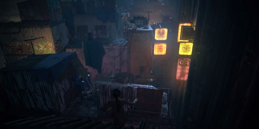
One level with superb design is the rooftop chase in Uncharted: The Lost Legacy. Chloe and Nadine get caught breaking into the office of Asav, a man trying to spark a civil war in India. They manage to escape by jumping out of a window and then have to run, jump, and climb across the slum rooftops all while avoiding gunfire. Developers work to find a way to make levels easy to navigate while not being too linear, and they also find ways to tell us where to go without holding our hands or sticking big waypoints everywhere – it’s a hard balance to strike, but here, Naughty Dog nails it.
RELATED: Jak 2 Marked Naughty Dog's Shift Into The Dark Storytelling We Know It For Today
In practice, level design is a synthesis of environmental art, lighting, and the actual terrain we traverse – and probably loads of other elements that are so subtle the average player doesn’t even consider them. In Lost Legacy, after bursting through the window and onto the rooftops below, strips of corrugated iron form ramps and point towards wires that can be used as ziplines. Straight lines have been used in all forms of visual media, from painting to photography to film – our eyes are naturally drawn to them and follow them, making them the perfect “invisible” sign post. Corrugated iron is a great tool for this level, as it fits into the aesthetic of the slums, contains multiple straight lines all travelling in the same direction, and is able to reflect light in order to draw the eye in even more.
After the first few turns, a conveniently placed zipline is highlighted by a row of warm light bulbs that contrast heavily with the stormy night sky and cold iron and concrete roofs. Light is used brilliantly throughout this level – a beam of light peeking out from behind an ajar door is an obvious invitation to peek back behind it. Darkness signifies the edge of a roof or wall you can’t jump over, while lights tell you where to go. It’s hard to make conscious decisions when you’re being shot at and having to leap over vertigo-inducing drops, but bright lights attract our eyes like moths to a flame and give us a good place to aim for. During the level’s darker section, Nadine runs in front of you, so all you have to do is follow her for a while. This is a great way to be able to enjoy the chase without having to think too much about what route to take – you just need to worry about the obstacles directly in front of you.
While video games as a medium have a language, so too do specific games. The Uncharted series has frequently used yellow to denote climbable ledges, a feature adopted by Horizon Zero Dawn. On the roofs, yellow ledges may look a little out of place, but neon yellow signs? Those fit the cityscape perfectly. When Nadine pulls back and Chloe takes point again, yellow signs mark the way forward, ushering you towards safety. After that, it’s back to the straight lines of the corrugated iron on the floor and warm lights on other roofs. The level keeps mixing and matching these various “signs” to stop any of them becoming repetitive or obvious. They’re meant to act as subtle nudges that your subconscious recognises before you have time to analyse them critically, as that would pull you out of the thrill of the chase – I have to analyse games for a living though. Shut up, yes it is a real job.
I’ve written before about how bad minimaps make me appreciate my surroundings, but Lost Legacy forgoes minimaps altogether. Instead, all of the above design features coalesce to lay out a path. Depending on your level of experience with games, this path may be as obvious as the glowing neon signs Chloe clambers over, or it may be as faint as deer tracks in a forest… which might be clear anyway if you’re a hunter. Look, it’s not a perfect metaphor, okay? The rooftops are a fantastic example of the visual language and codes adopted by video games, ripped from other audiovisual mediums and repurposed for our benefit.
Next: Life Is Strange: True Colors Needs To Show A Realistic Depiction Of Grief
