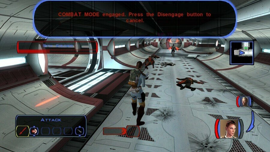
If you’ve been enjoying Star Wars: Knights of the Old Republic on the Nintendo Switch this weekend, one thing you’ve no doubt noticed is the overly large combat text box that comes up whenever you are engaged in battle.
Many players thought it was a bug at first, but Aspyr – the developer behind this version of BioWare’s legendary RPG – has seemingly confirmed it’s as intended. Aspyr’s community manager detailed this over on Discord (via r/kotor):
“Hi guys! Hope you’re already enjoying the game. The combat text box is intended behaviour but we are always happy to hear player feedback! You can forward it to our dev team via [email protected] or by submitting a request on support.aspyr.com. Thank you so much for your support!”
To further clarify, the same Aspyr team member explained how the size of this box was also as intended:
“I asked regarding the text box size and it was indeed intended, as far as I know.”
Players are now calling for Aspyr to “fix” it by offering more text bubble sizes, or by allowing it to be disabled in the options menu. Again, though – if you’re finding it to be a problem, let Aspyr’s development team know.
And for anyone curious, this is our own capture from an older version on Steam – the combat text box is far less noticeable:
Apart from this, Apsyr’s latest Star Wars launch has gone relatively well, and is doing much better than its previous Switch release Star Wars: Republic Commando, which experienced quite a lot of issues at launch. Apart from the text box, how are you finding KOTOR on Switch so far? And if you haven’t played what’s considered to be one of the greatest RPG of all time, then check out our review.
