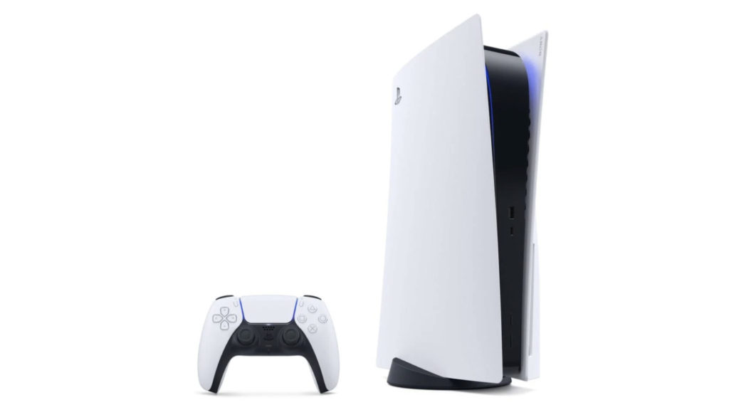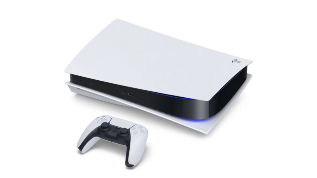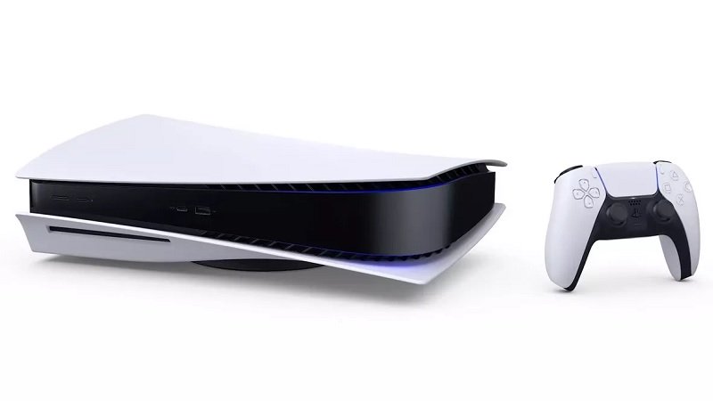
While the PS3’s UI was a huge improvement over the PS2’s and so was the PS4’s over the PS3’s (in most ways… more on that later), so too should we expect the PS5’s UI to be an improvement over Sony’s current flagship gaming console, the PlayStation 4.
No reasonable person would say the PS4’s UI is fundamentally bad, but certainly there is some room for improvement here. Odds are Sony has a handle on this, but just to be sure, we here at Gamingbolt do want to throw in our two cents on the matter of UI improvements for the PS5.
Pinned Apps:
The method of organizing all of your applications into one, single, horizontal bar has been a mainstay characteristic for PlayStation UI’s for quite a long time. The Vita being the one exception with it’s rather bizarre bubble system. But even the Vita’s UI, with all of its weirdness and unintuitiveness, knew that people like to organize their applications how they see fit.
Having everything in one horizontal bar is nice and clean, and I don’t want to necessarily want to see that go away, but the downside of that is that any game or application gets pushed back everytime I use something else, forcing me to go hunt for it later, regardless of how much I like it. In a world where nobody goes back to something once moving on to something else, this would make sense, but that is not the world we live in. If you happen to buy 4 or 5 games at once and try them all out, then the game you were playing before gets pushed back despite you not really wanting that to necessarily happen.
While Sony did eventually give us folders to put multiple applications in, and that is very nice, it doesn’t really resolve this problem because that folder is subject to the same system the applications are and it’ll just get pushed back every time you use something else. This is something the PS3 didn’t have an issue with as everything of a different category would automatically be awarded its own folder and spot in the UI, so organization was baked in.
The best way for Sony to keep their massive horizontal line (which we like) and not lose all the organization of their past UI’s would be a simple option to pin an application or game to the front of the line on the PS5. In fact, this is something Sony could still do for the PS4. Just stick it in the options menu that can be accessed while hovering over something. Easy Peasy.
Better Social Integration:
This is something that I feel like Sony already has the right idea on, but perhaps just needs to rethink their execution. The What’s New pane on the PS4 can show you lots of things like progress on games that your friends are making, when your friends play a new game for the first time, and also when they earn trophies or post screen shots. This is all good and well, but unfortunately the idea is held back by the large clunky layout of every status update only allowing one or two on screen at any moment, and Sony clogging it up with ads for sales and new games, which are simply not necessary here.
Sony can advertise itself on it’s own platform in many ways, but getting between me and seeing my friends updates’ shouldn’t be one of them. If they can make these statuses smaller, cleaner, while also giving the pane a bigger portion of the screen to work with, that would make this particular feature much more fun to use. Again, this is something I’m a little baffled that Sony hasn’t already done for the PS4, but regardless, the PS5 is a great opportunity to turn this thing around.
Another point I would make about this is that, if they aren’t going to clean it up, then they should at least give us the option to hide it and free up more space for our games and applications. If they don’t want to do that either, then at the very least Sony could take it off the main media bar and stick it in the friends menu, which would probably make more sense anyway as the updates are about my friends in the first place.
More Options With Content Creation:
It’s definitely true that Sony has made great strides with the share functionality over the years. Pictures, videos, and streaming all have a decent amount of options, but for the PS5 there are a few things that would make plenty of sense to include to modernize the system. For instance, saving video clips at 60 frames per second would be nice, as that is an ever-emerging standard for Youtube videos as well as just a more accurate way to show footage of a game that runs at 60. On top of that, 4k video would also be nice to see as that resolution becomes more and more standardized.
Perhaps right now these things don’t sound particularly necessary, but I’d bet my dollar that will change within the next year or so. We are on the verge of 4k video being standard pretty much everywhere and 60 frames are asked for in games more than ever. Why wouldn’t we want those parameters for our custom clips on PS5? Sony needs to be proactive about this instead of reactive. Let people record high quality videos of their gameplay and that will result in more people sharing content of their games. It’s a true win-win.
Clean up the Notifications:
Out of all of the things that irritate one’s OCD on the PS4, the notification menu is the most egregious offender. Out of all of the things you can see on your notification area, you can check up on your downloads, installations, your trophies, community posts, friend requests and messages. And you know what? I don’t have a problem with that at all. All of these things, as unrelated as they seem, are all things that you may very well want to be notified of, so their inclusion in the menu makes sense on that level. However, there is basically zero organization.
All of these types of notifications (and more) are just crammed into the same list with the order in which they happened being the sole factor deciding the order you see them in. There has to be more of an attempt made to organize all this on the PS5. If players want to see all their friend requests and messages, they should be able to select that. If they just want to see their downloads, they should be able to access that particular list. If I want to see all the recent activity in the handful of communities I’m in, I shouldn’t have to hunt through installation updates and trophy notifications to find them. Again, I feel this could be solved on the PS4 as well but here we are.
Settings or Options. Pick one:
I’m personally quite a fan of the options button. It gives you what amounts to a mobile settings menu for any one item you happen to be hovering over that only shows up if you want it to. Thus eliminating the need to go to a settings item on the menu and dig through it to find the one or two things I want. The problem with the PS4 is that it has both the forward-thinking options menu as well as the more archaic, labyrinthian settings menu that includes everything under the sun.
This can lead to some confusion as most things you can access on the options menu are in the settings, but some things aren’t, so if you want to do any one thing you basically have a 50% chance of finding it on your first try of either method. For instance, if you want to delete a game, simply go to it, hit options, and delete it. Easy.
But if you want to upload your saves to online storage or download old ones from online storage, you need to go to your settings, find the saved data management option, find the game you want to manage from there, and do it from there. Why not just put online data management in the options menu for every game? Why do I need to go through all these steps to manage the saved data for one game when something as nifty as the options menu already exists? This is a prime example of one of the many things that should just be accessible in the options menu. In fact, every option that has anything to do with anything should be in the options menu for that item. Shouldn’t it?
If they did this, and then just kept big-picture stuff like parental controls and account management in the general settings menu, that would not only make the options button far more useful but also clean up the general settings menu quite a bit as it would no longer need any of those redundant items. Most importantly though, it would make my ability as an end user to do the things I want far more effortless, which is the entire mission statement of any User Interface in the first place, isn’t it?
All that said, if Sony’s legacy of neat and tidy UIs are any indication, we are probably in for a nice improvement with the next console. Lets just hope Sony doesn’t stray too far from what the PS4 got right to correct what it didn’t.
Note: The views expressed in this article are those of the author and do not necessarily represent the views of, and should not be attributed to, GamingBolt as an organization.

