No film has ever made me fear the edges of the screen more so than It Follows. The slow, panning shots ensured I kept my eyes darting from end to end so I could spot the monster slowly walking towards the centre of the frame. Dead Space, on the other hand, forces my gaze inward, fixing it on Isaac and his RIG suit while the terrors of the USG Ishimura are allowed to hide in my peripheral vision. Visceral Games’ dedication to a diegetic HUD and commitment to slow, deliberate controls take the horror in Dead Space to new heights.
The vast majority of games feature a UI that sits on the border of your screen so that you have an unobstructed view of the action unfolding in the centre of the frame. This also means that every time your eyes dart towards the corners to check your ammo or glance at the minimap, there’s a chance you’ll spot a potential ambush location hidden in the fringes of a level. Because you’re already anticipating them, jump scares aren’t really effective. Looking around more also demystifies the game’s setting – you can keep the fear at bay by rationalising things or learning your way around. Unlike Alien: Isolation’s Sevastopol, which you learn to navigate by backtracking through wide corridors and open hub spaces, the dark, cramped hallways of the Ishimura actively resist your gaze and keep their secrets hidden.
RELATED: Dead Space Doesn't Need A Remake
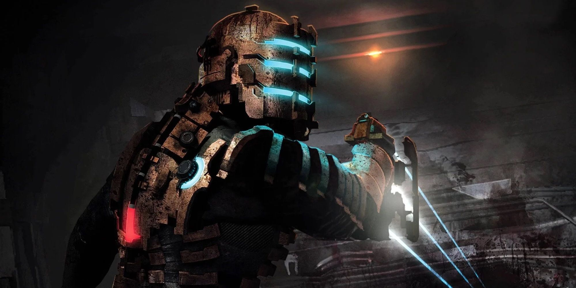
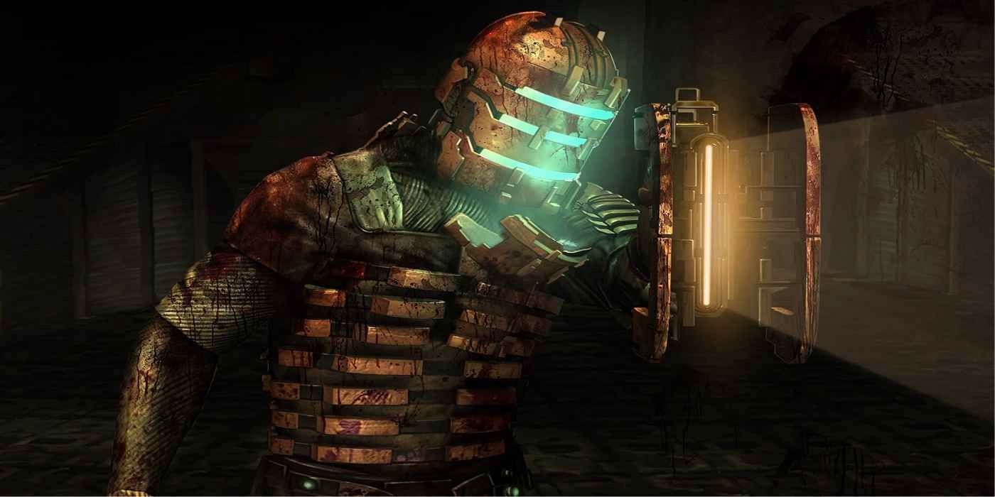
Dead Space’s UI is built into and around Isaac’s RIG suit and is designed to hold your focus on the middle of the screen. Isaac’s back displays his remaining health and stasis charge, videos and audio logs are played in the centre of the screen, and your ammo is displayed on your weapon, forcing you to hold it up so that the game camera zooms in and strips you of your peripheral vision. All these actions pull you into the screen as opposed to allowing you to plunder its edges. In doing so, they make the screen larger, deeper, and more mysterious. Dead Space refuses to allow you to peacefully satiate your intrigue by letting your eyes wander – instead, it masterfully directs your gaze so that it has full control over the scares it plans to dish out.

The weighty nature of Dead Space’s controls also helps to focus your gaze. It’s unhurried by design. Mobility is one way to break free from the dread within the broken down hull of the Ishimura, so Visceral Games places Isaac in a cumbersome suit that prevents him from turning his head too far before he has to turn his body too. By making you unable to snap around to investigate strange sounds, Dead Space lets your mind race as the anticipation of what Eldritch horror caused the disturbance fills you with terror and dread. By the time you’ve turned around and found there's nothing to be seen, you’re left to wonder if you imagined it, or if the culprit snuck away and is waiting to torment you further. The movement speed isn’t a consequence of an old or poorly made game, it’s a deliberate, conscious choice designed to strip you of power and leave you vulnerable and afraid.
Dead Space’s control of your gaze and its mobility features coalesce in the form of the flashlight affixed to your weapon. Set in a decaying Planet Cracker-class ship, Dead Space contains a lot of areas with little light. We’re afraid of the dark because we don’t know what’s in it, and our imaginations are untethered in that empty space full of potential nightmares. A torch illuminates these spaces and dispels our fears by revealing that nothing is hidden after all. Even when something does lurk in the shadows, it’s normally not as frightening as what we imagine, and so we are able to overcome it. The torch in Dead Space isn’t quite so friendly as ones in other games. The only way to light it is to aim your weapon. This slows Isaac down even more and zooms the camera in so that your gaze is now embedded even deeper into the screen. The torch isn’t illuminating – it’s isolating. It allows you to see what’s directly in front of you at the cost of being able to see anything else.

When a body drops from a vent and lands on the floor with a wet thud, you see it clearly because Visceral has trained your vision to the middle of the screen. This allows the play of light and shadow in the corner of your eye to create an atmosphere of unease – you know there are terrors ahead, so you dare not look away, but you fear the horrors your mind creates on the fringes of your senses. There’s tension between what’s right in front of you and what could be all around you, which ensures Dead Space never loses its momentum. Visceral’s horror game is a masterclass of design, and the remake needs to retain the essence of what made Dead Space so terrifying all those years ago.
Next: I Can't Finish RPGs


