
With Grand Theft Auto 3 and Grand Theft Auto: Vice City establishing Rockstar’s darling franchise as a household name in gaming, it is understandable that a lot of eyes were set upon whatever the developer was doing next with the franchise. After a two-year-long development cycle, Grand Theft Auto: San Andreas would finally release to rave reviews and equally great commercial reception, the latter of which made the game the best selling PS2 game of all game.
Set in the state of San Andreas which was heavily inspired by California and Nevada, the game managed to deliver the most heartfelt narrative of the series up until that point. Grand Theft Auto: San Andreas has now received a Definitive Edition as a part of Grand Theft Auto: The Trilogy – The Definitive Edition, and a fair bit has been changed under the hood. Let’s have a look.
Lighting
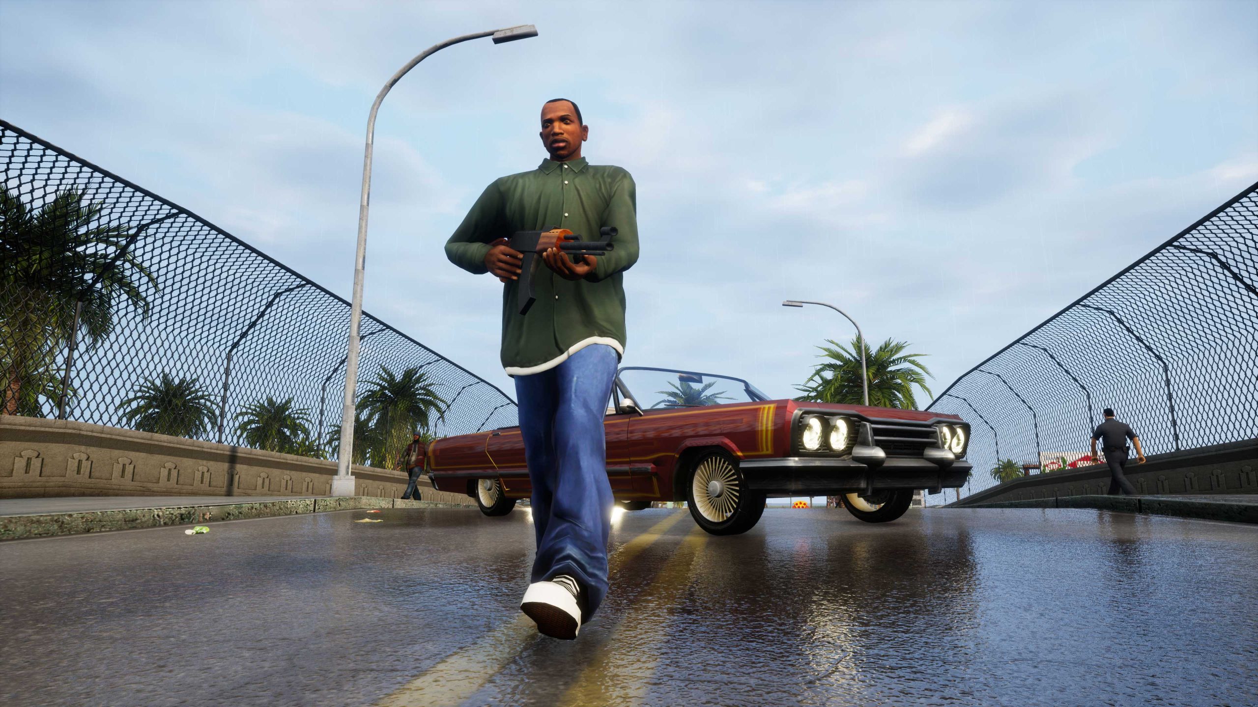
The original Grand Theft Auto: San Andreas seems to be using the same lighting system found in the first two games, although there are some noticeable yet subtle improvements right away. Shadows seem to have higher resolution and are cast with a fair bit of accuracy. There’s heavy use of baked-in reflections, with one particular instance being how the lights cast themselves around the bottom of the palm trees. The same technique seems to have been put in place for most buildings and other environment objects as well. However, there are some problems as well. Vehicle surfaces are non-reflective which gives the game a rather dull look as if they are made with pastel colours, which is something that had been a point of minor criticism when the game was released. It might be an aesthetic design choice from Rockstar but it definitely looks rather dull today.
The game’s Definitive Edition is built on Unreal Engine 4 and uses a brand-new lighting system to great effect. As one could notice immediately upon booting the game, the world looks a lot richer than its original counterpart thanks to details such as accurate and high-resolution shadows. Surfaces of vehicles also reflect sunlight and other sources of lights such as traffic lights, street lights, and even the lights wrapped around the palm trees I mentioned earlier. With the new lighting systems in place, the world seems to be a lot brighter and sunny – giving it a rather distinct look when compared to the original.
Character Models
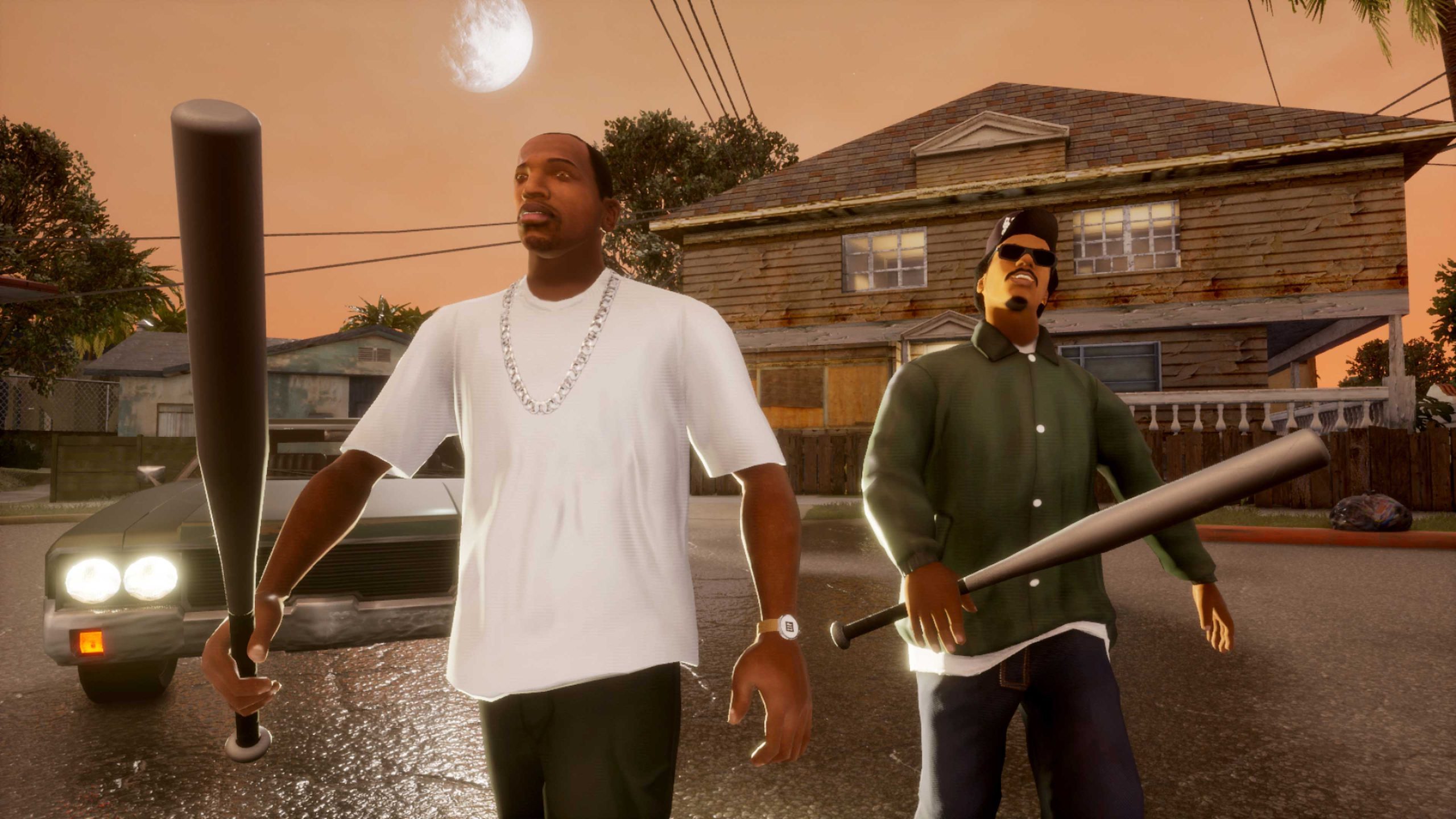
Rockstar was already struggling to pack character models, texture assets, and a whole lot of stuff into the 32 MB of RAM on the PlayStation 2, and of course with San Andreas’ map size dwarfing those found in Vice City and GTA 3, it is rather understandable why character models don’t seem to have a massive improvement. On top of that, the game also had to account for even more character models for NPCs as the state of San Andreas is home to a multicultural group of people that all need to look different from one another. Polygon counts roughly look to be the same as Vice City, which already had double of those found in Grand Theft Auto 3. However, better facial animations do make the overall presentation a bit more palatable than previous entries – making it a net improvement.
The Definitive Edition seems to be using some sort of AI upscaling for the textures and character models, with manual re-touching presumably being done to retain an authentic look. However, out of all three entries in the trilogy – San Andreas seems to have fared the worst in terms of updated character models. Even lead protagonist Carl Johnson doesn’t look quite up to the mark, and the same can be said for many other character models too. The environment on the other hand looks great, although as previously mentioned – a great deal of the heavy lifting seems to have been done by the updated lighting.
Streaming, NPC Density, and Draw Distance
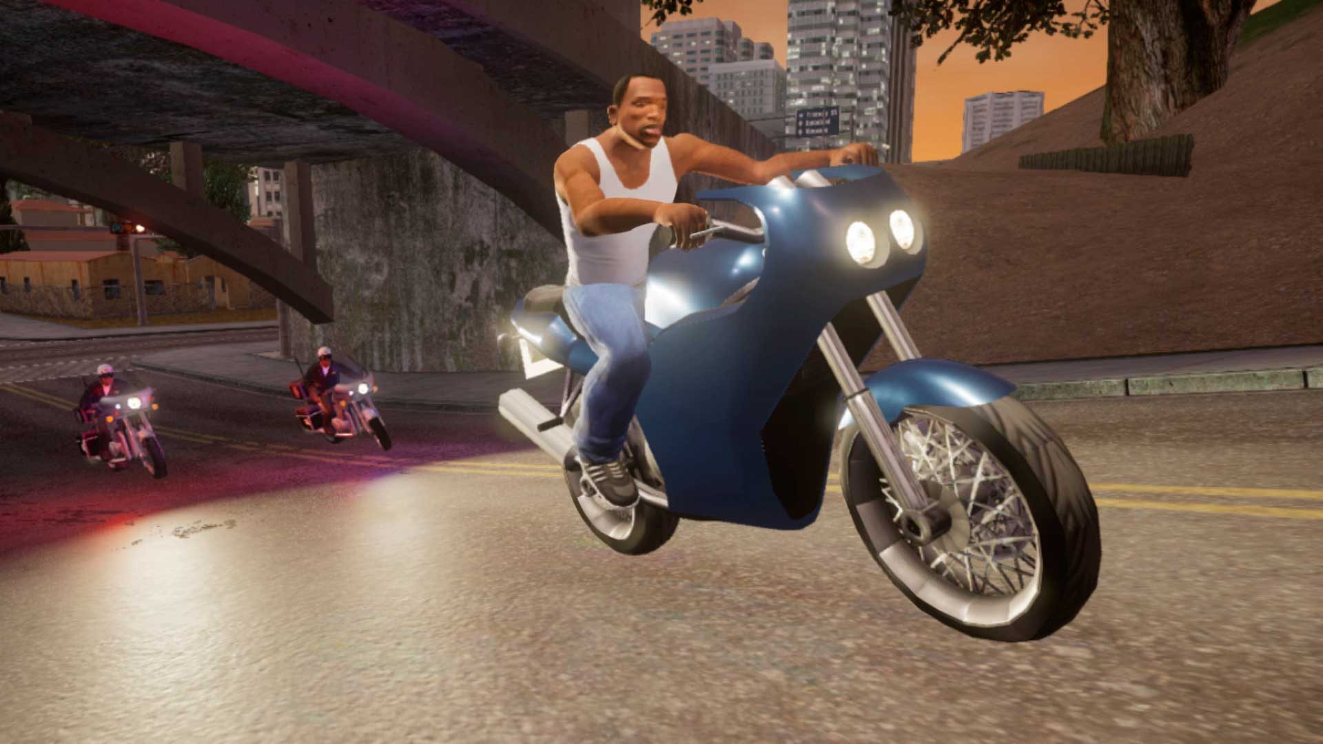
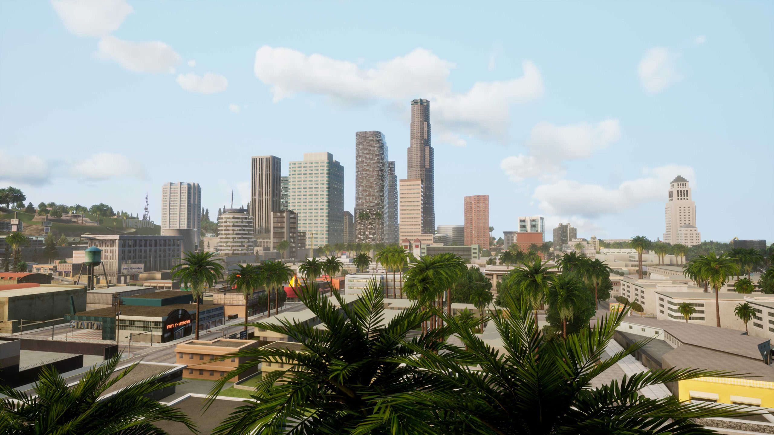
Grand Theft Auto: San Andreas uses the same RenderWare engine used in previous entries in the series, although major updates to the engine allow the game to have both denser and larger environments without having to sacrifice any performance. The game’s map isn’t just a city like Vice City or GTA 3, but is an entire state – you got Los Santos, San Fierro, Las Venturas as well as vast stretches of city outskirts. Las Venturas and Los Santos look pretty impressive with their dense neighborhoods giving the illusion of a believable space. NPCs are, of course, varied and appear more in number. The AI is also a bit more sophisticated, as enemy gang members will try to take you down if you step into their territory. Draw distance also seems to have received a boost, although the game uses fog to mask details in faraway areas of the map and give the illusion of a bigger map. Overall the streaming technology is the most efficient across the three entries – and the game definitely pushes the hardware of that generation to its absolute limit.
Of course, it isn’t as big of a deal in the modern gaming landscape where we have games that are exponentially larger than San Andreas. Rendering such a huge world without any issues isn’t a big deal either, especially for a game engine like Unreal Engine 4 which is used by the game’s Definitive Edition. An increased level of detail in characters and surrounding environments doesn’t demand any cutbacks to the draw distance, it’s quite the contrary. The draw distance is increased, which is especially evident when you’re zooming across the city in either a fast car or skirting along the top of buildings in an airplane. However, the fog is absent which makes the game’s map feel smaller than the original – which might be an issue for fans of the original release. NPCs seem to roughly have the same number, although that didn’t require much of an upgrade anyway.
Animation And Other Improvements
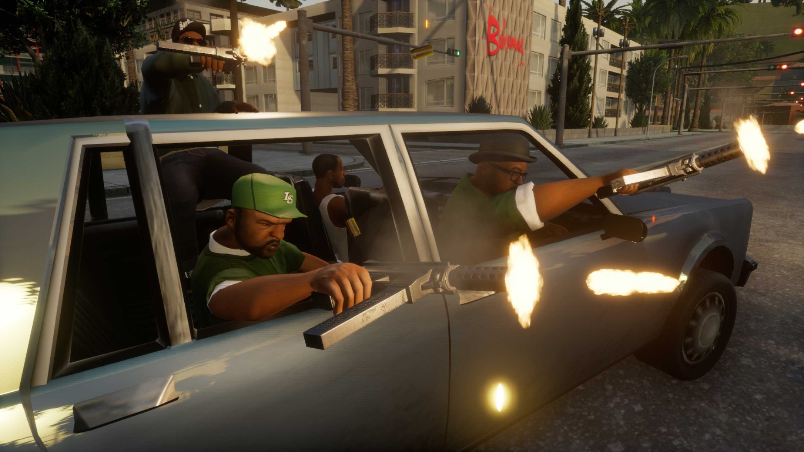
Rockstar used motion capture and stop motion capture techniques to create animations for Vice City, and the same techniques seem to be in place for San Andreas too. Protagonist Carl Johnson can swim, climb ledges, and roll while in combat – which of course, required a bunch of new animations to be made. The animations are also much more varied and fluid, making it a big improvement over the original. However, there aren’t any noticeable improvements to the animations in the Definitive Edition to speak of. On the loading front, the original release takes several seconds to load on the PS2 hardware. Load times are vastly improved over the original in the Definitive Edition, thanks to modern hardware equipped with SSDs. On a PS5, the game takes just a handful of seconds to load a save.
Physics And Attention To Detail
Grand Theft Auto: San Andreas has a pretty sophisticated physics system that’s a major improvement over Vice City in a number of subtle yet effective aspects. You could hop on bicycles, attach nitrous boosters to cars, switch cars to low rider modes, ride a jetpack or parachute – all of which have their own physics systems in place. The Definitive Edition doesn’t tamper with it in any noticeable way.
However, there are some changes in attention to detail. Explosions and smoke are better across the board with high-resolution textures, plus waves are much more realistic. Flora and fauna seem to have been added to water bodies, which is noticeable when diving underground. After lobbing grenades, the terrain texture on the area of impact changes to reflect the explosion – compared to the original which only leaves a black mass of texture on the spot. I didn’t particularly notice any notable changes to the interactivity with the environment.
Conclusion
Grand Theft Auto: San Andreas has received a litany of improvements over the original in a number of key areas, most importantly lighting which breathes new life into this decade-old game. Of course, the same cannot be said for the character models – which haven’t received the love they should have had. There aren’t any noticeable changes to the game’s animations or physics, making it a pretty mediocre repackaging of the original. As such, it would have been in the game’s best interest to spend some more time in the oven.


