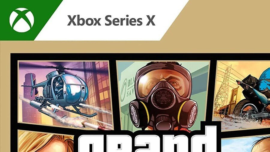

GTA 5 arrived on next-gen consoles last month, well, digitally at least. The physical launch came a month or so later, and well, those copies are now out in the wild – and they look a little odd.
At first glance, it appears as though Xbox is testing a new style of box art, with a pretty big border surrounding the game’s artwork. However, it seems this design is specifically for GTA 5 alone. This is the first time we’ve seen this on a Series X game, and it reminds us of those ugly ‘Greatest Hits’ cases you see from generations gone by:
The digital version of GTA 5’s Xbox Series X and S version also has the same gold trim (albeit not quite as pronounced), so it seems Rockstar chose this design as a way to differentiate between the last-gen and current-gen versions. The PS5 version has it, too.
A strange choice if you ask us, but an interesting talking point all the same!
What do you make of this new case design style for GTA 5? Let us know in the comments.
[source reddit.com]


