Electronic Arts is remaking Dead Space, bringing back an iconic horror game and a very popular horror franchise. Expectations for the remake are understandably high. It's been nearly 13 years since Dead Space was first released, so a remake would likely entail some dramatic improvements depending on the scope of the project. Unsurprisingly, fans of the Dead Space series are anxious to see exactly what those improvements might look like. Motive Studio developers have now offered a first look, including an eye-opening screenshot comparison.
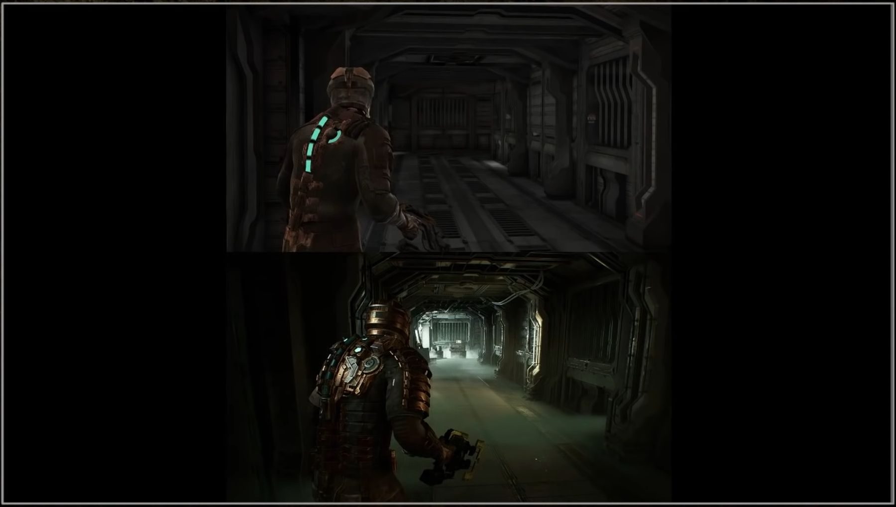
On Tuesday, Motive shared an Early Development Livestream for Dead Space. The stream showed some early footage of what the Dead Space remake currently looks like, or at least a small example of what it could look like that's very much an alpha. To say the two games look dramatically different would be a gross understatement. While the map layouts looked similar in the comparison, the two games are visually worlds apart. The updated Dead Space is very much an entirely different game in appearance.
RELATED: This Dead Space Feature Sounds Like It's Straight Out of God of War
The screenshot comparison that was shown captures the biggest differences between the original Dead Space and its remake. Dead Space protagonist Isaac is the first thing that players will notice. Do note that Motive says that Isaac is still being worked on. Dead Space's protagonist has been entirely rebuilt from the ground up. There's much more detail in every aspect of the engineer's armor and particularly the apparatus that displays Isaac's health. If anything, it might be a bit too much for a simple engineer's gear.

Where it gets really exciting is the visual updates made to the Dead Space environment of the Ishimura spaceship. There's rich dynamic lighting being shown, as shadows hide around every corner. That's on top of a new level of detail that's clearly focused on authentically recreating the original game's explorable spaces. Motive has obviously added its own touch, too, with industrial wires and pipes running along the walls. The biggest change, however, is the addition of smoky vapor along the floor.
Considering how old the original game is, Motive could likely get away with much more dramatic changes without shaking the boat. Fans of the classic Dead Space will certainly still have their criticisms, though. Whether it's Isaac's new suit or the cloudy vapor, the new game is balancing authenticity and new ideas. How much will trudging through a layer of fog change the experience compared to stomping on empty metal? It'll depend on the player.
It's worth repeating that Dead Space is pre-alpha. It still has over a year of development left. The recent teases are just glimpses at what Dead Space will become when it's finished. Motive simply wanted to provide fans an idea of what the game will look like. In that regard, Motive has delivered as promised.
Dead Space releases late 2022 on PC, PS5, and Xbox Series X/S.
MORE: What We Know About The Dead Space Remake (And What We Want)


