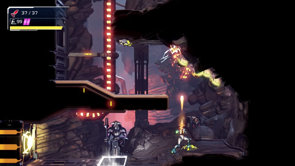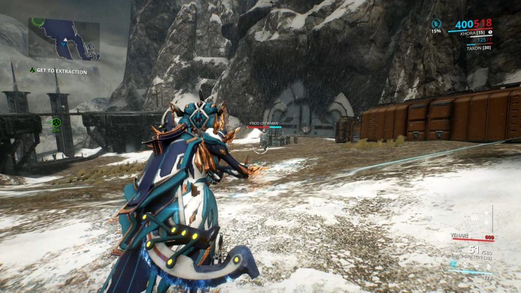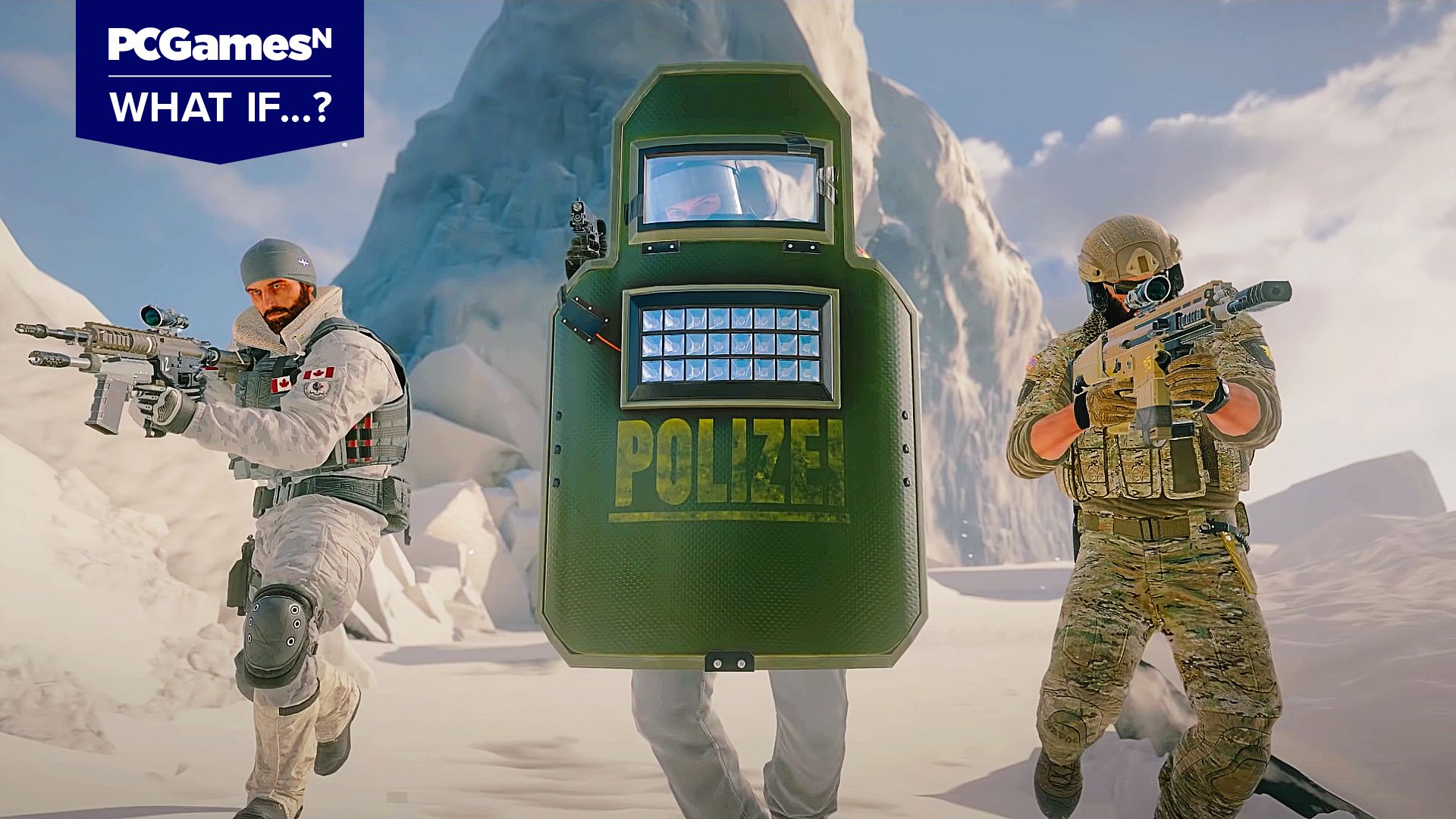
Back 4 Blood is rich in accessibility options, and they are only growing with every beta. Still, it’s not perfect – not yet. That’s kind of the point in betas. One of those imperfections is its HUD – an overstuffed mess that gives me a headache just looking at it, but, more importantly, it’s claustrophobic and anxiety-inducing.
You have your objectives in top left, every player is listed on the bottom left, and then you have your weapons and extras on the bottom right. Besides that, tutorials pop up in the center with subtitles and stamina joining in on the fun. Finally, there’s the frequent info that appears in the top right corner – stuff like “James saved BiggusDickis.” There’s far too much going on and no way to customize it as of yet.
RELATED: Back 4 Blood's Ogre Is Still Missing The Mark
Not only is there a lot, but it’s incredibly text-heavy. Even perusing the cards and more hero-like elements of the characters (Cleaners) was a bit of a hamfisted introduction that didn’t feel intuitive whatsoever. Still, it was easy to get into because, at its core, Back 4 Blood is a modern Left 4 Dead entry. However, the HUD is something I couldn’t look past. Having so much clutter on my screen, so much text popping up, so much to distract me from the action brings me unprecedented stress. Ironically, Dead Space – an anxiety-inducing horror – is easier to play in this regard because it limits its HUD to the center of the screen by having your health bar on your back and the ammo counter on the guns.
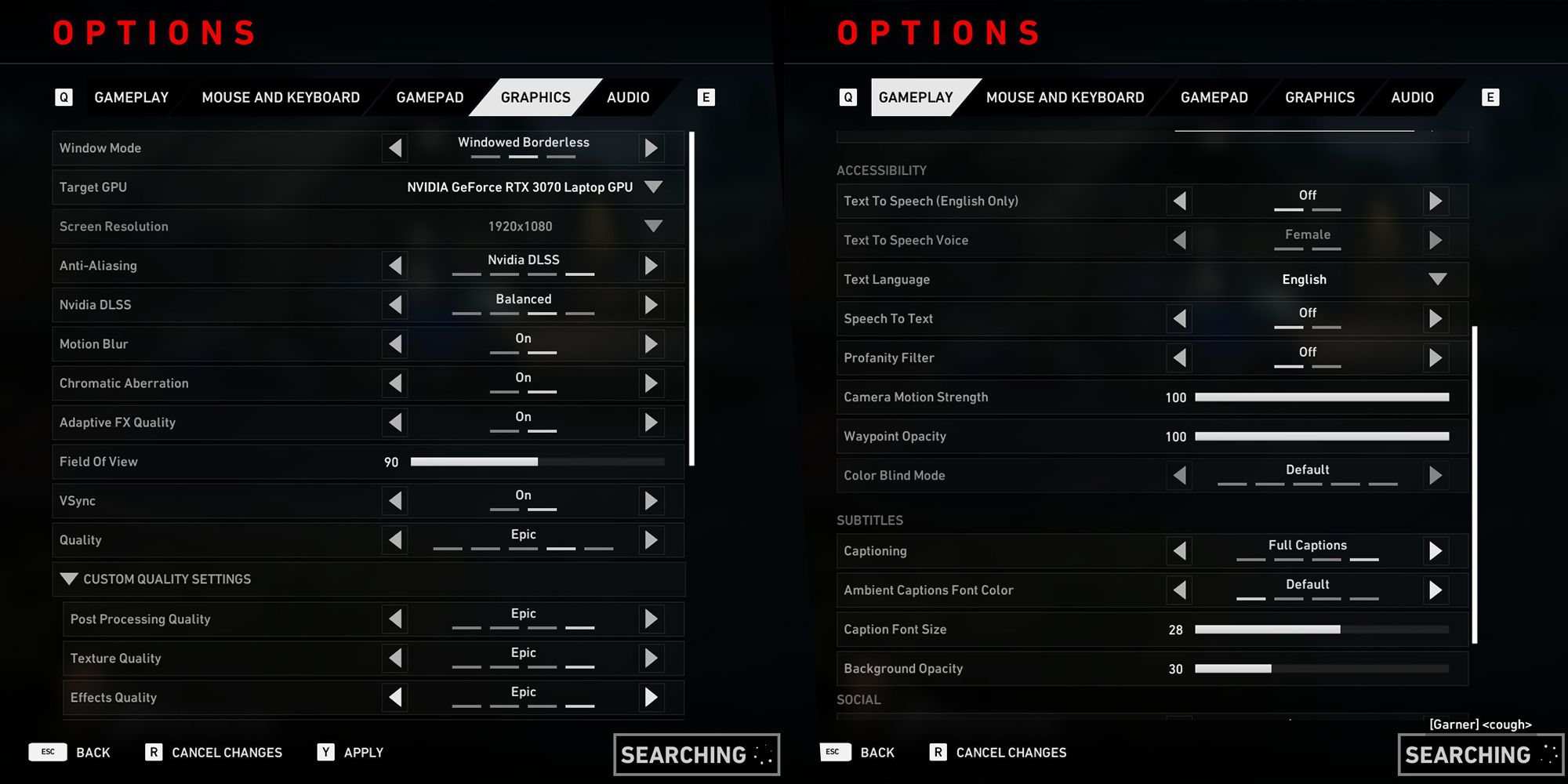
Cluttered HUDs are a medium-wide problem. So many games suffer from information overload. It’s hard to get immersed in the rip-and-tear zombie gore action when my eyes are busy darting all over the screen. It’s not so severe that I’m getting panic attacks, but it certainly makes me uneasy and that’s why customization is so vital. The Elder Scrolls Online is one of the best examples of it. You can have key combat elements appear on-screen automatically, set a bind to disable the HUD entirely, and you can resize it to your preference.
If I had the choice, I would set it so that my teammates’ graphics only popped up if they were down or on low HP; I'd have my health displayed at all times but without the Cleaner icon; mission objectives would be at a lower opacity; guns and equipment on the bottom right would be disabled altogether. Immediately, the screen is cleaner thanks to removing Cleaners. Currently, there is no way to do any of that. You’re stuck with what you’ve got.
The most that you can do is disable subtitles, but I’m a little hard of hearing, so they’re handy to have. You can’t resize the HUD either, which is a problem for two entirely different types of people. It’s too big for me personally, lending itself to the claustrophobic feeling of being squashed into a little box, but it might be too small for others. Having choice is paramount when it comes to accessibility concerns, yet there’s little in this regard.
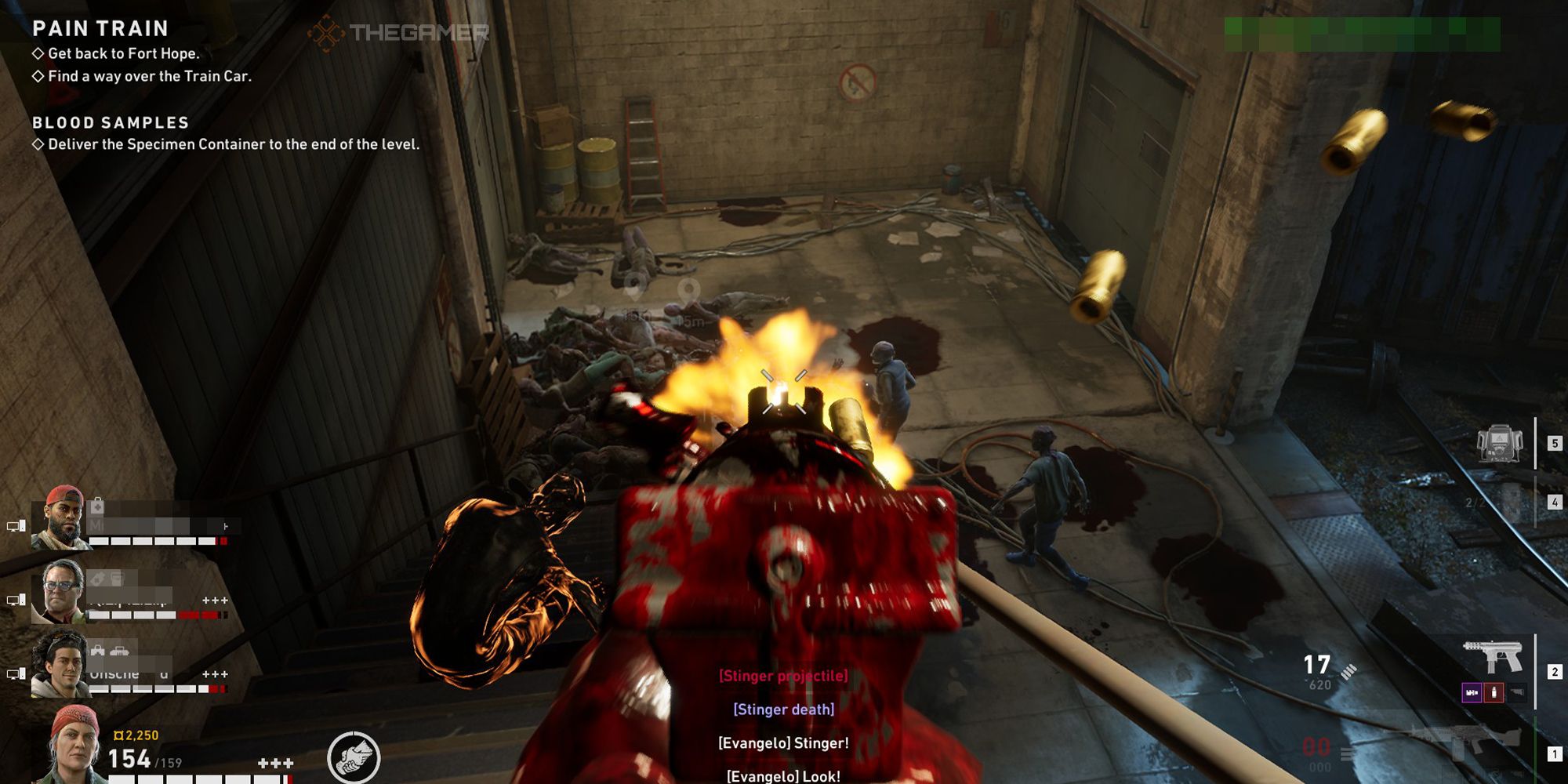
Back 4 Blood has excellent accessibility in other areas, and so it’s not a dig at Turtle Rock Studios – it seems to be taking efforts to make sure anybody and everybody can boot up Back 4 Blood and have a good time, but this is something that it’s neglected so far.
That’s why choice is important – not gutting the HUD across the board just because of players like me. For some – especially those with cognitive disabilities – having the weapon and equipment icons beside the button prompts is incredibly helpful. Meanwhile, always seeing other player’s HP can benefit those who want to ensure that group synergy stays intact. That’s why choice is important. Everybody is different, and everybody has their own needs.
Given that Back 4 Blood launches in two months and the fact that each beta has been implementing more and more in the way of accessibility options, I’m optimistic that HUD settings are something we could see added. The game is an absolute treat to play so far and this is the only major pitfall, so I hope that Turtle Rock is taking notes.
Next: Back 4 Blood's Versus Mode Doesn't Hook Me, But Neither Did Left 4 Dead's
