I recently bought They Are Billions in a sale on PS4, which is a bit embarrassing because I just wrote about how 7 Days To Die has the best zombie hordes around. Anyway, I booted the game up, knowing it was ported to consoles from PC. I’ve played strategy games on my PS4 before, and I don’t have a good enough PC to run many 3D games, so I just accept the controls will be a bit clunky and get on with it – I still have fun.
However, one horrifying trend I’ve noticed absolutely needs to stop: enough with the tiny UI. Both of my housemates are developers and primarily PC gamers, so I understand the assumption that everyone playing these games has three huge widescreen monitors sitting on their desk. Firstly, that’s only true for one of them, the other uses a good laptop, so that’s one myth busted. Secondly, people shouldn’t need to immerse themselves in a 210-degree gaming den to read a pause menu, that’s absurd. I love the simplicity afforded by console gaming – I have my TV, and my sofa, maybe my desk chair if I need to get really close to the screen.
RELATED: Mass Effect Shows How Games Should Be Remade To Incorporate Accessibility, Not Remastered
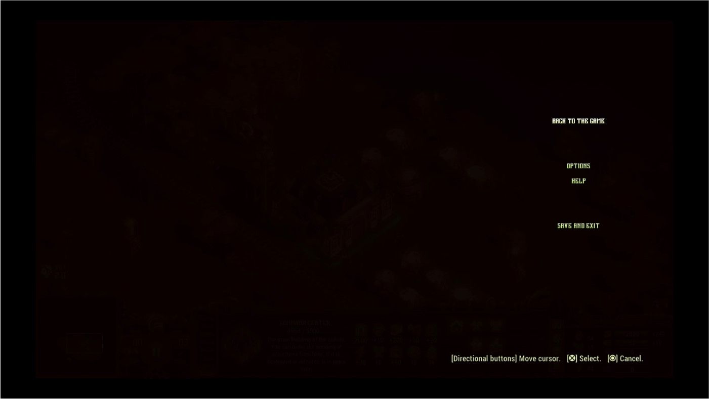
They Are Billions’ user interface feels like the straw that broke the camel’s back here. It didn’t help that the game was buggy as soon as I started – cutscenes stuttered and lagged while the audio files desynced and played on as if nothing was amiss. The worst part is how once the audio file had ended, I still had to sit through the rest of a crooked cutscene until the video had concluded. For that reason, I skipped the story stuff and got straight into the campaign, only to be met with the worst pause menu I’ve ever seen, and I’m not exaggerating. I’ve included a picture of it below so you can see it for yourself.

Even on a PC monitor that’s five inches from your face, there’s no need to jam an entire pause menu into the corner of the screen like that. I haven’t adjusted the ratio of that picture at all, the menu genuinely is that small and lets all of that blank space go to waste. I just don’t understand it as a design decision, it doesn’t even look cool, it’s a nuisance and nothing more. Now, I know I may be more sensitive to this as I have appallingly bad eyesight. I’m a -8 and -8.5, with astigmatism thrown in for good measure, so I know I’m at a disadvantage here already, but that’s why I think a decently sized UI is so important. I wouldn’t mind if the game had the option to make the UI bigger, or more centered, but there’s nothing. Zip, zilch, nada.
They Are Billions continues a long history of games that are severely lacking in accessibility options, though some are bucking that trend. On PC, there are more third-party options available to players, but on console, we get what we’re given. All I’m asking is for some options that let me actually see the game I’m playing properly. I would love to get stuck into this game because it seems really fun – at least, that’s what my friends who can actually see it tell me.
Next: Zoom In: Dragon's Dogma's Pawn System Removes The Most Toxic Element Of Online Play: Other Players